Discover the best table templates crafted with HTML, CSS, and Bootstrap to enhance your web design. Whether you're building a dashboard, admin panel, or pricing table, these stylish and responsive templates will save you time and effort. From simple layouts to fully featured tables with sorting and pagination, explore a range of designs tailored to modern web needs.
Creating Modern Table Designs with Bootstrap 5.3.3
Introduction
In this blog post, we’ll explore five stylish table designs built with Bootstrap 5.3.3 and custom CSS. Each table showcases unique aesthetics and functionality, ranging from vibrant purple headers to glassmorphic effects and professional palettes. These designs are responsive, user-friendly, and perfect for dashboards, reports, or data-heavy applications. Whether you need sticky headers, scrollable containers, or hover effects, these examples provide practical solutions for modern web development.
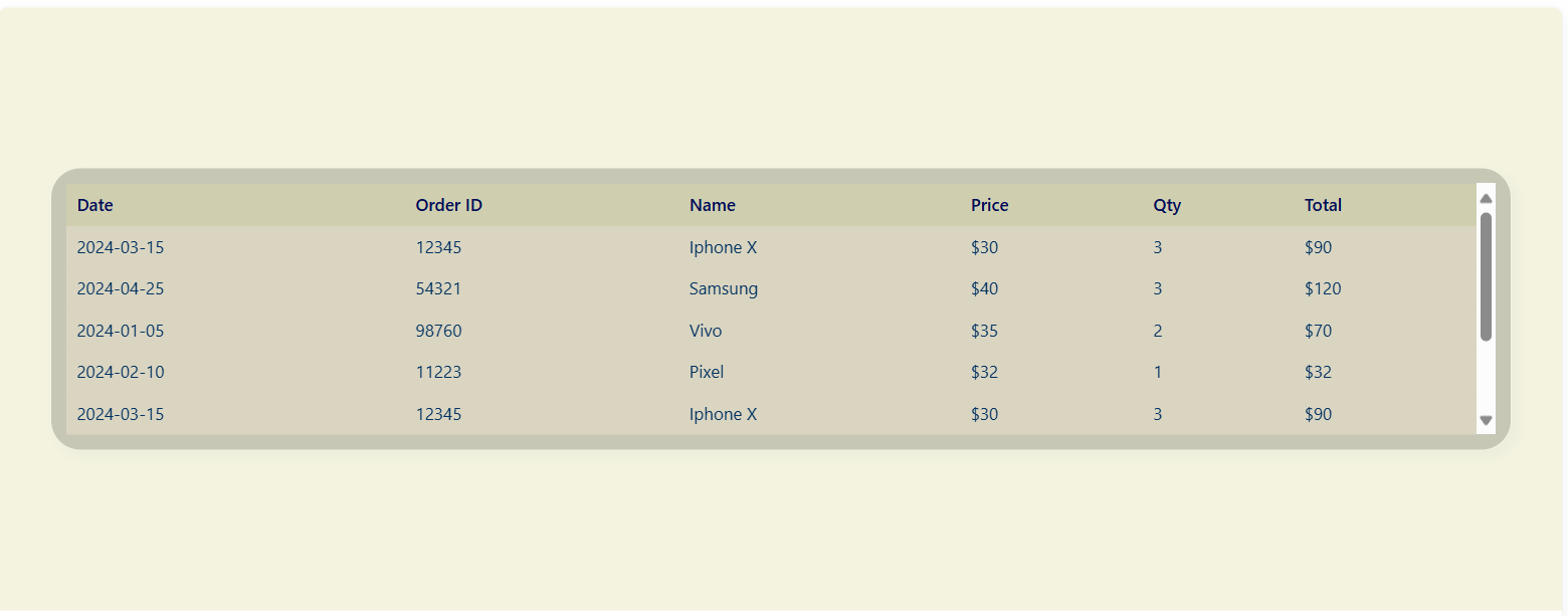
Table 1: Vibrant Purple Header
Overview Table1
This table features a clean design with a vibrant purple header, a white background, and a subtle shadow effect. It’s wrapped in a responsive container with vertical scrolling for large datasets, making it ideal for e-commerce dashboards or inventory tracking.

Code Implementation
HTML
<!DOCTYPE html>
<html lang="en">
<head>
    <meta charset="utf-8">
    <meta name="viewport" content="width=device-width, initial-scale=1">
    <title>Table 1 Preview</title>
    <link href="https://cdn.jsdelivr.net/npm/bootstrap@5.3.3/dist/css/bootstrap.min.css" rel="stylesheet">
    <link href="https://fonts.googleapis.com/css2?family=Poppins:wght@400;500;600&display=swap" rel="stylesheet">
    <link rel="stylesheet" href="styles.css">
</head>
<body>
    <div class="table-wrapper-preview">
        <div class="table-responsive-preview">
            <table class="table table-custom table-sm">
                <thead>
                    <tr>
                        <th>Date</th>
                        <th>Order ID</th>
                        <th>Name</th>
                        <th>Price</th>
                        <th>Qty</th>
                        <th>Total</th>
                    </tr>
                </thead>
                <tbody>
                    <tr><td>2024-03-15</td><td>12345</td><td>Iphone X</td><td>$30</td><td>3</td><td>$90</td></tr>
                    <tr><td>2024-04-25</td><td>54321</td><td>Samsung</td><td>$40</td><td>3</td><td>$120</td></tr>
                    <tr><td>2024-01-05</td><td>98760</td><td>Vivo</td><td>$35</td><td>2</td><td>$70</td></tr>
                    <tr><td>2024-02-10</td><td>11223</td><td>Pixel</td><td>$32</td><td>1</td><td>$32</td></tr>
                </tbody>
            </table>
        </div>
    </div>
</body>
</html>
CSS (styles.css)
html, body {
    height: 100%;
    margin: 0;
    padding: 0;
    overflow: hidden;
    font-family: 'Poppins', sans-serif;
}

body {
    background-color: #c4d3f6;
    display: flex;
    align-items: center;
    justify-content: center;
    padding: 10px;
}

.table-wrapper-preview {
    width: 100%;
    max-width: 95%;
    background: white;
    border-radius: 8px;
    overflow: hidden;
    box-shadow: 5px 5px 8px rgba(0, 0, 0, 0.08);
}

.table-custom thead th {
    background-color: #6c7ae0;
    color: #fff;
    font-weight: 500;
    font-size: 0.85rem;
    padding: 0.5rem;
}

.table-custom tbody td {
    padding: 0.5rem;
    font-size: 0.85rem;
    vertical-align: middle;
    border-top: 1px solid #dee2e6;
}

.table-custom {
    margin-bottom: 0;
}

.table-responsive-preview {
    max-height: 220px;
    overflow-y: auto;
}
Code Explanation
HTML Structure:
-
The table uses Bootstrap 5.3.3's table, table-sm classes for a compact, responsive layout.
-
It is wrapped in a table-wrapper-preview div for a white background and shadow effect, and a table-responsive-preview div for vertical scrolling.
-
External resources include Bootstrap 5.3.3 CSS via CDN and Google Fonts (Poppins) for modern typography.
-
The table contains columns for Date, Order ID, Name, Price, Qty, and Total, with sample data for products.
CSS Styling:
-
The html, body are set to full height with no margins, using overflow: hidden to prevent unwanted scrolling and Poppins font for consistency.
-
The body has a light blue background (#c4d3f6) and uses flexbox (display: flex) to center the table vertically and horizontally.
-
The table-wrapper-preview is styled with a white background, rounded corners (border-radius: 8px), and a subtle shadow (box-shadow) for a card-like effect.
-
The table header (thead th) uses a vibrant purple background (#6c7ae0) with white text, a medium font weight, and smaller font size (0.85rem) for compactness.
-
The table body (tbody td) has light grey borders (border-top: 1px solid #dee2e6) and consistent padding for readability.
-
The table-responsive-preview enables vertical scrolling with a maximum height of 220px using overflow-y: auto.
-
The table-custom class ensures no bottom margin (margin-bottom: 0) to fit neatly within the wrapper.
Conclusion
This table combines simplicity and functionality with a vibrant purple header and a clean, shadowed design. It’s responsive, easy to customize, and perfect for straightforward data presentation in applications like e-commerce or inventory systems. The vertical scrolling and compact layout make it ideal for handling large datasets in a constrained space.
Table 2: Glassmorphic Design
Overview Table2
This table embraces a glassmorphism-inspired design with a translucent background, sticky header, and a calming yellow-blue palette. It includes elegant hover effects and is ideal for dashboards or modern UI designs.
Code Implementation
HTML
<!DOCTYPE html>
<html lang="en">
<head>
    <meta charset="utf-8">
    <meta name="viewport" content="width=device-width, initial-scale=1">
    <title>Table 2 Preview</title>
    <link href="https://cdn.jsdelivr.net/npm/bootstrap@5.3.3/dist/css/bootstrap.min.css" rel="stylesheet">
    <link rel="stylesheet" href="styles.css">
</head>
<body>
    <div class="intro-preview-wrapper">
        <div class="card mask-custom">
            <div class="card-body">
                <div class="table-responsive">
                    <table class="table table-borderless table-sm mb-0 mytable">
                        <thead>
                            <tr>
                                <th>Date</th>
                                <th>Order ID</th>
                                <th>Name</th>
                                <th>Price</th>
                                <th>Qty</th>
                                <th>Total</th>
                            </tr>
                        </thead>
                        <tbody>
                            <tr><td>2024-03-15</td><td>12345</td><td>Iphone X</td><td>$30</td><td>3</td><td>$90</td></tr>
                            <tr><td>2024-04-25</td><td>54321</td><td>Samsung</td><td>$40</td><td>3</td><td>$120</td></tr>
                            <tr><td>2024-01-05</td><td>98760</td><td>Vivo</td><td>$35</td><td>2</td><td>$70</td></tr>
                            <tr><td>2024-02-10</td><td>11223</td><td>Pixel</td><td>$32</td><td>1</td><td>$32</td></tr>
                        </tbody>
                    </table>
                </div>
            </div>
        </div>
    </div>
</body>
</html>
CSS (styles.css)
html, body {
    height: 100%;
    margin: 0;
    padding: 0;
    overflow: hidden;
}

body {
    background-color: #F3F3E0;
    display: flex;
    align-items: center;
    justify-content: center;
}

.intro-preview-wrapper {
    width: 100%;
    max-width: 95%;
    padding: 10px;
}

.mask-custom {
    background: rgba(24, 24, 16, 0.2);
    border-radius: 1.5em;
    backdrop-filter: blur(4px);
    border: 1px solid rgba(255, 255, 255, 0.05);
    background-clip: padding-box;
    box-shadow: 5px 5px 8px rgba(46, 54, 68, 0.03);
}

.card.mask-custom .card-body {
    padding: 0.75rem;
}

.mask-custom tbody tr:hover td {
    background-color: #8ACCD5;
色: #160f51;
}

.mytable thead tr th {
    color: #000B58;
    font-size: 0.85rem;
    padding: 0.4rem 0.5rem;
    background-color: #CFCFAF;
}

.mytable thead th {
    background-color: var(--header-bg);
    color: var(--header-text);
    font-weight: 500;
    font-size: 0.8rem;
    padding: 0.4rem;
    position: sticky;
    top: 0;
    white-space: nowrap;
    z-index: 10;
    border-bottom: 1px solid var(--border-color);
}

.mytable tbody tr td {
    color: #003161;
    font-size: 0.85rem;
    padding: 0.4rem 0.5rem;
}

.mytable th,
.mytable td {
    background: rgba(255, 241, 213, 0.338);
}

.mytable caption h2 {
    color: #000000;
    text-align: center;
    font-size: 1rem;
    margin-bottom: 0.5rem;
}

.table-responsive {
    max-height: 200px;
    overflow-y: auto;
}
Code Explanation
HTML Structure:
-
Built with Bootstrap 5.3.3, using table, table-borderless, and table-sm classes for a minimal, compact design.
-
The table is nested within a card with a mask-custom class for a glassmorphic effect, inside an intro-preview-wrapper for layout control.
-
A table-responsive div ensures vertical scrolling for overflow content.
-
The table structure mirrors Table 1, with columns for Date, Order ID, Name, Price, Qty, and Total.
CSS Styling:
-
The html, body are set to full height with overflow: hidden to control layout.
-
The body uses a light cream background (#F3F3E0) and flexbox to center the table.
-
The intro-preview-wrapper sets a maximum width (95%) with padding for spacing.
-
The mask-custom class creates a glassmorphic effect using a semi-transparent background (rgba(24, 24, 16, 0.2)), backdrop-filter: blur(4px) for a frosted look, and a subtle border and shadow.
-
The table header (thead th) uses a yellow-pastel background (#CFCFAF) with navy text (#000B58), and is made sticky (position: sticky; top: 0) to remain visible during scrolling.
-
The table cells (th, td) have a semi-transparent background (rgba(255, 241, 213, 0.338)) for the glassmorphic effect.
-
Hover effects on rows (tbody tr:hover td) change the background to soft blue (#8ACCD5) with dark text (#160f51) for interactivity.
-
The table-responsive sets a maximum height of 200px with vertical scrolling (overflow-y: auto).
Conclusion
This glassmorphic table with a sticky header and interactive hover effects is visually refined and functional. It’s perfect for analytics dashboards or light-themed UIs, offering a modern and readable layout. The translucent design and calming yellow-blue palette enhance its aesthetic appeal, while the sticky header improves usability for large datasets.
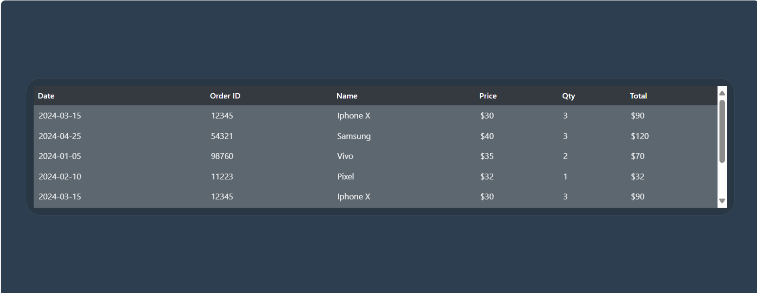
Table 3: Glassmorphic Dark Table
Overview Table3
This table features a dark-themed, glassmorphic design with a translucent background over a full-page background image. It includes a sticky header and a vivid green hover effect, making it suitable for dashboards with elegant dark UIs.
Code Implementation
HTML
<!DOCTYPE html>
<html lang="en">
<head>
    <meta charset="utf-8">
    <meta name="viewport" content="width=device-width, initial-scale=1">
    <title>Table 3 Preview</title>
    <link href="https://cdn.jsdelivr.net/npm/bootstrap@5.3.3/dist/css/bootstrap.min.css" rel="stylesheet">
    <link rel="stylesheet" href="styles.css">
</head>
<body>
    <div class="intro-preview-wrapper">
        <div class="card mask-custom">
            <div class="card-body">
                <div class="table-responsive">
                    <table class="table table-borderless table-sm mb-0 mytable">
                        <thead class="table-dark">
                            <tr>
                                <th>Date</th>
                                <th>Order ID</th>
                                <th>Name</th>
                                <th>Price</th>
                                <th>Qty</th>
                                <th>Total</th>
                            </tr>
                        </thead>
                        <tbody>
                            <tr><td>2024-03-15</td><td>12345</td><td>Iphone X</td><td>$30</td><td>3</td><td>$90</td></tr>
                            <tr><td>2024-04-25</td><td>54321</td><td>Samsung</td><td>$40</td><td>3</td><td>$120</td></tr>
                            <tr><td>2024-01-05</td><td>98760</td><td>Vivo</td><td>$35</td><td>2</td><td>$70</td></tr>
                            <tr><td>2024-02-10</td><td>11223</td><td>Pixel</td><td>$32</td><td>1</td><td>$32</td></tr>
                            <tr><td>2024-03-15</td><td>12345</td><td>Iphone X</td><td>$30</td><td>3</td><td>$90</td></tr>
                            <tr><td>2024-04-25</td><td>54321</td><td>Samsung</td><td>$40</td><td>3</td><td>$120</td></tr>
                            <tr><td>2024-01-05</td><td>98760</td><td>Vivo</td><td>$35</td><td>2</td><td>$70</td></tr>
                            <tr><td>2024-02-10</td><td>11223</td><td>Pixel</td><td>$32</td><td>1</td><td>$32</td></tr>
                        </tbody>
                    </table>
                </div>
            </div>
        </div>
    </div>
</body>
</html>
CSS (styles.css)
html, body {
    height: 100%;
    margin: 0;
    padding: 0;
    overflow: hidden;
}

body {
    background-image: url('images/bg.jpeg');
    background-size: cover;
    background-position: center center;
    background-color: #2c3e50;
    display: flex;
    align-items: center;
    justify-content: center;
}

.intro-preview-wrapper {
    width: 100%;
    max-width: 95%;
    padding: 10px;
}

.mask-custom {
    background: rgba(24, 24, 16, 0.2);
    border-radius: 1.5em;
    backdrop-filter: blur(4px);
    border: 1px solid rgba(255, 255, 255, 0.05);
    background-clip: padding-box;
    box-shadow: 5px 5px 8px rgba(46, 54, 68, 0.03);
}

.mask-custom tbody tr:hover td {
    background-color: #23e78f;
    color: #160f51;
}

.mytable th, .mytable td {
    background: rgba(246, 246, 246, 0.25);
    color: #f0f0f0;
    font-size: 0.85rem;
    padding: 0.4rem 0.5rem;
}

.mytable thead th {
    background-color: var(--header-bg);
    color: var(--header-text);
    font-weight: 500;
    font-size: 0.8rem;
    padding: 0.4rem;
    position: sticky;
    top: 0;
    white-space: nowrap;
    z-index: 10;
    border-bottom: 1px solid var(--border-color);
}

.mytable thead.table-dark th {
    color: #ffffff;
    background-color: #343a40;
}

.mytable caption h2 {
    color: #ffffff;
    text-align: center;
    font-size: 1rem;
    margin-bottom: 0.5rem;
}

.card.mask-custom .card-body {
    padding: 0.75rem;
}

.table-responsive {
    max-height: 200px;
    overflow-y: auto;
}
Code Explanation
HTML Structure:
-
Uses Bootstrap 5.3.3 with table, table-borderless, and table-sm classes for a clean, compact layout.
-
The table is wrapped in a card with a mask-custom class for a glassmorphic effect, within an intro-preview-wrapper for layout.
-
The header uses Bootstrap’s table-dark class for a dark background.
-
A table-responsive div enables vertical scrolling.
CSS Styling:
-
The html, body are set to full height with overflow: hidden.
-
The body has a dark fallback color (#2c3e50) and uses flexbox to center the table.
-
The intro-preview-wrapper ensures a maximum width (95%) with padding.
-
The mask-custom class applies a glassmorphic effect with a semi-transparent background (rgba(24, 24, 16, 0.2)), backdrop-filter: blur(4px), and a subtle border and shadow.
-
The header (thead.table-dark th) uses a dark background (#343a40) with white text (#ffffff), made sticky (position: sticky; top: 0) for visibility.
-
Table cells (th, td) use a semi-transparent background (rgba(246, 246, 246, 0.25)) with light text (#f0f0f0) for readability.
-
Hover effects (tbody tr:hover td) highlight rows in vivid green (#23e78f) with dark text (#160f51).
-
The table-responsive sets a maximum height of 200px with vertical scrolling.
Conclusion
This dark-themed, glassmorphic table is elegant and modern, with sticky headers and vivid hover effects. It’s ideal for data-rich applications with dark UI themes and can be customized with different colors or background images. The translucent background and green hover effect create a striking visual contrast, enhancing both aesthetics and usability.
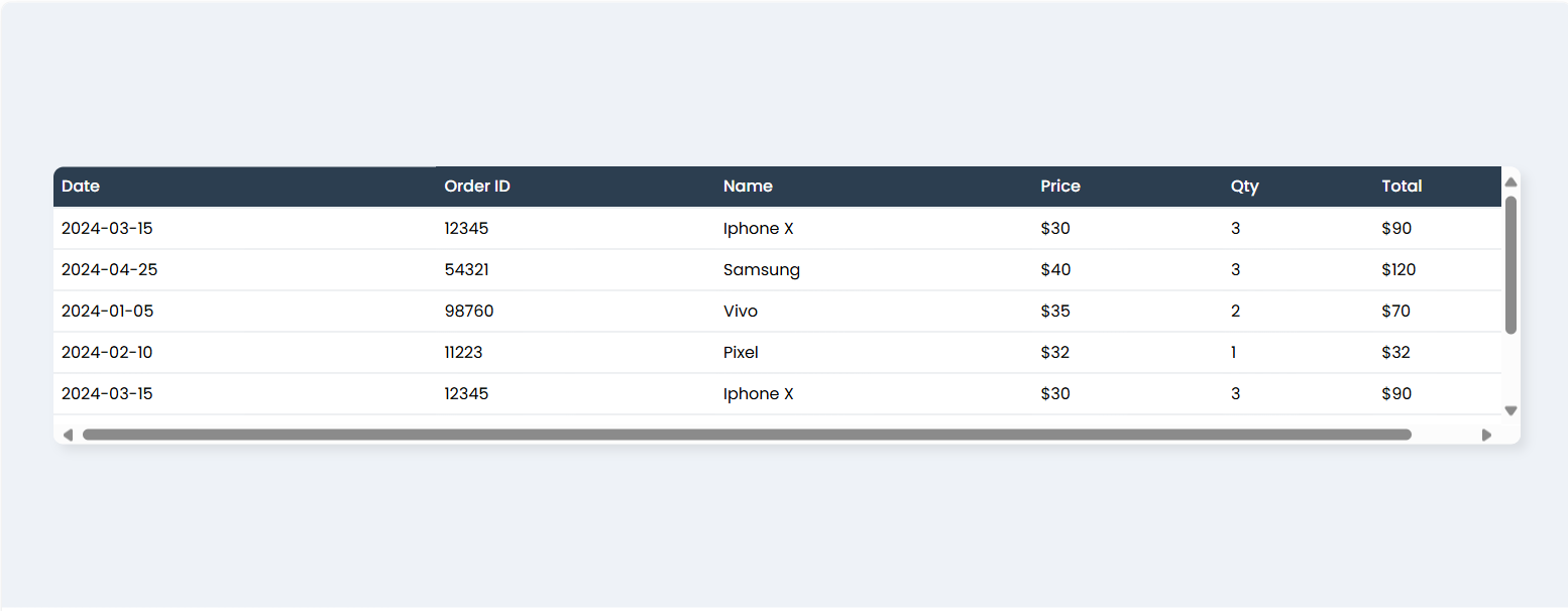
Table 4: Horizontal Scrolling
Overview Table4
This table uses a professional grey and teal palette with a sticky header and a white container. It supports horizontal and vertical scrolling and includes a subtle hover effect, making it perfect for business dashboards or reports.
Code Implementation
HTML
<!DOCTYPE html>
<html lang="en">
<head>
    <meta charset="utf-8">
    <meta name="viewport" content="width=device-width, initial-scale=1">
    <title>Table 4 Preview - Professional Palette</title>
    <link href="https://cdn.jsdelivr.net/npm/bootstrap@5.3.3/dist/css/bootstrap.min.css" rel="stylesheet">
    <link href="https://fonts.googleapis.com/css2?family=Poppins:wght@400;500;600&display=swap" rel="stylesheet">
    <link rel="stylesheet" href="styles.css">
</head>
<body>
    <div class="table-wrapper-preview">
        <div class="table-container-preview">
            <table class="table table-custom table-sm">
                <thead>
                    <tr>
                        <th>Date</th>
                        <th>Order ID</th>
                        <th>Name</th>
                        <th>Price</th>
                        <th>Qty</th>
                        <th>Total</th>
                    </tr>
                </thead>
                <tbody>
                    <tr><td>2024-03-15</td><td>12345</td><td>Iphone X</td><td>$30</td><td>3</td><td>$90</td></tr>
                    <tr><td>2024-04-25</td><td>54321</td><td>Samsung</td><td>$40</td><td>3</td><td>$120</td></tr>
                    <tr><td>2024-01-05</td><td>98760</td><td>Vivo</td><td>$35</td><td>2</td><td>$70</td></tr>
                    <tr><td>2024-02-10</td><td>11223</td><td>Pixel</td><td>$32</td><td>1</td><td>$32</td></tr>
                    <tr><td>2024-03-15</td><td>12345</td><td>Iphone X</td><td>$30</td><td>3</td><td>$90</td></tr>
                    <tr><td>2024-04-25</td><td>54321</td><td>Samsung</td><td>$40</td><td>3</td><td>$120</td></tr>
                    <tr><td>2024-01-05</td><td>98760</td><td>Vivo</td><td>$35</td><td>2</td><td>$70</td></tr>
                    <tr><td>2024-02-10</td><td>11223</td><td>Pixel</td><td>$32</td><td>1</td><td>$32</td></tr>
                </tbody>
            </table>
        </div>
    </div>
</body>
</html>
CSS (styles.css)
:root {
    --body-bg: #eef2f7;
    --header-bg: #2c3e50;
    --header-text: #ffffff;
    --table-wrapper-bg: #ffffff;
    --row-hover-bg: #f3f6f9;
    --border-color: #d5dbdf;
}

html, body {
    height: 100%;
    margin: 0;
    padding: 0;
    overflow: hidden;
    font-family: 'Poppins', sans-serif;
}

body {
    background-color: var(--body-bg);
    display: flex;
    align-items: center;
    justify-content: center;
    padding: 10px;
}

.table-wrapper-preview {
    width: 100%;
    max-width: 95%;
    background: var(--table-wrapper-bg);
    border-radius: 8px;
    overflow: hidden;
    box-shadow: 5px 5px 8px rgba(0,0,0,0.08);
}

.table-container-preview {
    overflow-x: auto;
    -webkit-overflow-scrolling: touch;
    max-height: 220px;
}

.table-custom {
    margin-bottom: 0;
    width: 100%;
    min-width: 1200px;
}

.table-custom thead th {
    background-color: var(--header-bg);
    color: var(--header-text);
    font-weight: 500;
    font-size: 0.8rem;
    padding: 0.4rem;
    position: sticky;
    top: 0;
    white-space: nowrap;
    z-index: 10;
    border-bottom: 1px solid var(--border-color);
}

.table-custom tbody td {
    font-size: 0.8rem;
    padding: 0.4rem;
    vertical-align: middle;
    border-top: 1px solid var(--border-color);
    white-space: nowrap;
}

.table-custom tbody tr:hover {
    background-color: var(--row-hover-bg);
}
Code Explanation
HTML Structure:
-
Uses Bootstrap 5.3.3 with table, table-sm, and table-custom classes for a compact, professional layout.
-
The table is wrapped in a table-wrapper-preview div for a white background and shadow, and a table-container-preview div for horizontal and vertical scrolling.
-
External resources include Bootstrap 5.3.3 and Poppins font via Google Fonts.
-
The table structure is consistent with previous examples, with columns for Date, Order ID, Name, Price, Qty, and Total.
CSS Styling:
-
CSS variables (:root) define a grey and teal palette (e.g., --body-bg: #eef2f7, --header-bg: #2c3e50) for consistency.
-
The html, body are set to full height with overflow: hidden and Poppins font.
-
The body uses a light grey background (#eef2f7) and flexbox to center the table.
-
The table-wrapper-preview has a white background, rounded corners, and a subtle shadow for a professional look.
-
The header (thead th) uses a dark charcoal blue background (#2c3e50) with white text, made sticky (position: sticky; top: 0) for scrolling.
-
Table body cells (tbody td) have light borders and a small font size (0.8rem) for compactness.
-
Hover effects (tbody tr:hover) highlight rows in light grey (#f3f6f9) for interactivity.
-
The table-container-preview enables horizontal (overflow-x: auto) and vertical scrolling (max-height: 220px) with a minimum table width (1200px) for wide datasets.
Conclusion
This professional table design is clear and elegant, with a sticky header and scrollable container for enhanced usability. It’s ideal for business dashboards and reports, with a customizable palette and responsive layout. The grey and teal color scheme provides a clean, corporate aesthetic suitable for professional applications.
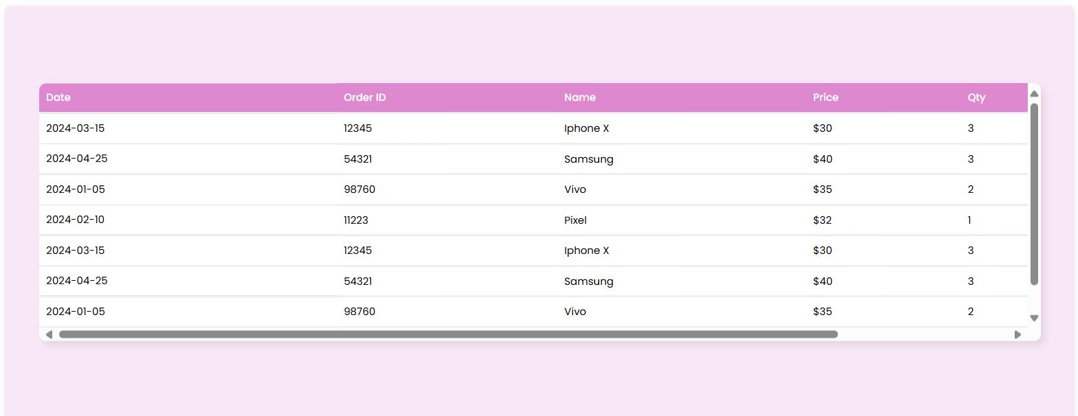
Table 5: Sticky First Column
Overview Table5
This table features a sticky first column and header with a soft pink-purple palette. It supports horizontal and vertical scrolling and includes a subtle hover effect, making it ideal for datasets where key row labels need to remain visible.
Code Implementation
HTML
<!DOCTYPE html>
<html lang="en">
<head>
    <meta charset="utf-8">
    <meta name="viewport" content="width=device-width, initial-scale=1">
    <title>Table 5 Preview</title>
    <link href="https://cdn.jsdelivr.net/npm/bootstrap@5.3.3/dist/css/bootstrap.min.css" rel="stylesheet">
    <link href="https://fonts.googleapis.com/css2?family=Poppins:wght@400;500;600&display=swap" rel="stylesheet">
    <link rel="stylesheet" href="styles.css">
</head>
<body>
    <div class="table-wrapper-preview">
        <div class="table-container-preview">
            <table class="table table-custom table-sm">
                <thead>
                    <tr>
                        <th>Date</th>
                        <th>Order ID</th>
                        <th>Name</th>
                        <th>Price</th>
                        <th>Qty</th>
                        <th>Total</th>
                    </tr>
                </thead>
                <tbody>
                    <tr><td>2024-03-15</td><td>12345</td><td>Iphone X</td><td>$30</td><td>3</td><td>$90</td></tr>
                    <tr><td>2024-04-25</td><td>54321</td><td>Samsung</td><td>$40</td><td>3</td><td>$120</td></tr>
                    <tr><td>2024-01-05</td><td>98760</td><td>Vivo</td><td>$35</td><td>2</td><td>$70</td></tr>
                    <tr><td>2024-02-10</td><td>11223</td><td>Pixel</td><td>$32</td><td>1</td><td>$32</td></tr>
                    <tr><td>2024-03-15</td><td>12345</td><td>Iphone X</td><td>$30</td><td>3</td><td>$90</td></tr>
                    <tr><td>2024-04-25</td><td>54321</td><td>Samsung</td><td>$40</td><td>3</td><td>$120</td></tr>
                    <tr><td>2024-01-05</td><td>98760</td><td>Vivo</td><td>$35</td><td>2</td><td>$70</td></tr>
                    <tr><td>2024-02-10</td><td>11223</td><td>Pixel</td><td>$32</td><td>1</td><td>$32</td></tr>
                </tbody>
            </table>
        </div>
    </div>
</body>
</html>
CSS (styles.css)
html, body {
    height: 100%;
    margin: 0;
    padding: 0;
    overflow: hidden;
    font-family: 'Poppins', sans-serif;
}

body {
    background-color: #F8E7F6;
    display: flex;
    align-items: center;
    justify-content: center;
    padding: 40px;
}

.table-wrapper-preview {
    width: 100%;
    max-width: 100%;
    background: white;
    border-radius: 8px;
    overflow: hidden;
    box-shadow: 5px 5px 8px rgba(0,0,0,0.08);
}

.table-container-preview {
    max-height: 300px;
    overflow-x: auto;
    overflow-y: auto;
    -webkit-overflow-scrolling: touch;
}

.table-custom {
    margin-bottom: 0;
    width: 100%;
    min-width: 1400px;
    border-collapse: separate;
    border-spacing: 0;
}

.table-custom thead th {
    background-color: #DD88CF;
    color: #fff;
    font-weight: 500;
    font-size: 0.75rem;
    padding: 0.5rem;
    position: sticky;
    top: 0;
    white-space: nowrap;
    z-index: 20;
    border-bottom: 1px solid #dee2e6;
}

.table-custom th:first-child,
.table-custom td:first-child {
    position: sticky;
    left: 0;
    z-index: 10;
    background-color: white;
}

.table-custom thead th:first-child {
    background-color: #DD88CF;
    z-index: 30;
}

.table-custom tbody td {
    font-size: 0.75rem;
    padding: 0.5rem;
    vertical-align: middle;
    border-top: 1px solid #dee2e6;
    white-space: nowrap;
}

.table-custom tbody tr:hover td {
    background-color: #f8f9fa;
}

.table-custom tbody tr:hover td:first-child {
    background-color: #f1f3ff;
}
Code Explanation
HTML Structure:
-
Uses Bootstrap 5.3.3 with table, table-sm, and table-custom classes for a compact layout.
-
The table is wrapped in a table-wrapper-preview div for a white background and shadow, and a table-container-preview div for horizontal and vertical scrolling.
-
External resources include Bootstrap 5.3.3 and Poppins font.
-
The table structure is consistent, with columns for Date, Order ID, Name, Price, Qty, and Total.
CSS Styling:
-
The html, body are set to full height with overflow: hidden and Poppins font.
-
The body uses a pastel pink background (#F8E7F6) and flexbox to center the table, with extra padding (40px) for spacing.
-
The table-wrapper-preview has a white background, rounded corners, and a subtle shadow.
-
The header (thead th) uses a pink-purple background (#DD88CF) with white text, made sticky (position: sticky; top: 0) with a high z-index (20).
-
The first column (th:first-child, td:first-child) is sticky (position: sticky; left: 0) with a white background, and the first header cell has a higher z-index (30) to overlap correctly.
-
Table body cells (tbody td) use small fonts (0.75rem) and light borders.
-
Hover effects (tbody tr:hover td) highlight rows in light grey (#f8f9fa), with the first column in subtle blue (#f1f3ff).
-
The table-container-preview enables horizontal and vertical scrolling (overflow-x: auto, overflow-y: auto) with a maximum height of 300px and a minimum table width of 1400px.
Conclusion
This table with a sticky first column and header is excellent for datasets requiring easy navigation. The soft pink-purple palette adds a friendly aesthetic, and the design is fully customizable for various branding needs. The sticky first column ensures key row labels remain visible, making it ideal for wide datasets with important identifiers
Final Thoughts (Overall Conclusion)
These five table designs demonstrate the versatility of Bootstrap 5.3.3 and custom CSS in creating modern, responsive, and visually appealing data displays. From vibrant headers to glassmorphic effects and professional palettes, each table serves a unique purpose while maintaining usability. Key features like sticky headers, sticky columns, scrollable containers, and hover effects enhance functionality for dashboards, reports, and data-heavy applications. The designs are highly customizable, allowing developers to adjust colors, fonts, and layouts to suit specific project needs. Further enhancements, such as adding interactive features like sorting, filtering, or pagination, can elevate these tables for more dynamic use cases. Experimentation with these designs can lead to tailored solutions for a wide range of web development projects.


Add a comment: