Credit Card Performance Summary Dashboard – Power BI Insights & KPIs
Dashboard Title: Credit Card Performance Summary
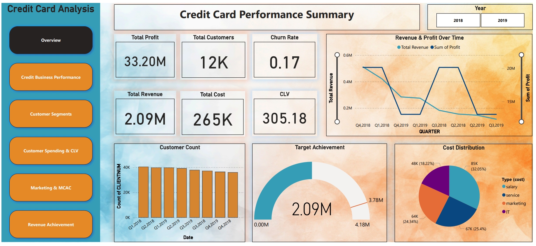
This dashboard gives a holistic overview of the company’s credit card performance by displaying key metrics, financial trends, customer insights, and cost-related data. It is designed to help stakeholders evaluate company health and make strategic decisions.
Section-wise Breakdown of the Dashboard Visuals
1. KPI Cards – Key Performance Indicators
These metrics are displayed at the top of the dashboard to provide a quick snapshot of business health.
|
KPI |
Value |
Meaning |
|---|---|---|
|
Total Profit |
₹33.2M |
Net earnings after deducting total costs |
|
Total Customers |
12K |
Number of active credit card users |
|
Churn Rate |
0.17 |
17% of customers have stopped using the card — signals retention issues |
|
Total Revenue |
₹2.09M |
Gross income generated from credit card usage |
|
Total Cost |
₹265K |
Total expenses incurred (marketing, salaries, services, etc.) |
|
Customer Lifetime Value (CLV) |
₹305.18 |
Average revenue expected from a customer over their entire relationship |
These indicators help in understanding profitability, customer engagement, and financial strength.
2. Line Chart – Revenue & Profit Over Time
-
X-axis: Quarters (From Q4 2018 to Q3 2019)
-
Y-axes:
-
Left Y-axis = Revenue
-
Right Y-axis = Profit
-
Insight:
This visualization highlights how revenue and profit fluctuate over different quarters. You can identify growth phases or dip periods which help in assessing seasonality or the impact of business strategies.
3. Bar Chart – Customer Count by Quarter
-
X-axis: Time Period by Quarters
-
Y-axis: Number of Customers
Insight:
This chart shows the trend of customer acquisition or churn. A rising bar indicates growth, while a decline may signal issues in customer retention.
4. Gauge Chart – Target Achievement
-
Current Revenue: ₹2.09M
-
Target Revenue: ₹4.18M
Insight:
The gauge indicates the company's progress towards its revenue target. Achieving only ~50% of the goal suggests a performance gap and potential need for corrective action.
5. Pie Chart – Cost Distribution by Category
This pie chart breaks down the total cost of ₹265K into categories:
|
Cost Type |
Amount |
Percentage |
|---|---|---|
|
Salary |
₹85K |
32.05% |
|
Service |
₹67K |
25.4% |
|
Marketing |
₹64K |
24.34% |
|
IT |
₹48K |
18.22% |
Insight:
The pie chart helps in identifying where the budget is being spent most, allowing the business to optimize high-cost areas or invest more strategically.
Purpose of the Dashboard
The Credit Card Performance Summary dashboard is built to provide:
-
An at-a-glance view of overall business health
-
Customer trends and financial performance
-
Insightful comparisons between targets and actual achievements
-
A breakdown of operational costs
Objective: Enable managers and analysts to make data-driven decisions for growth, retention, and profitability.