Customer Spending & CLV
Dashboard Title: Customer Spending & CLV
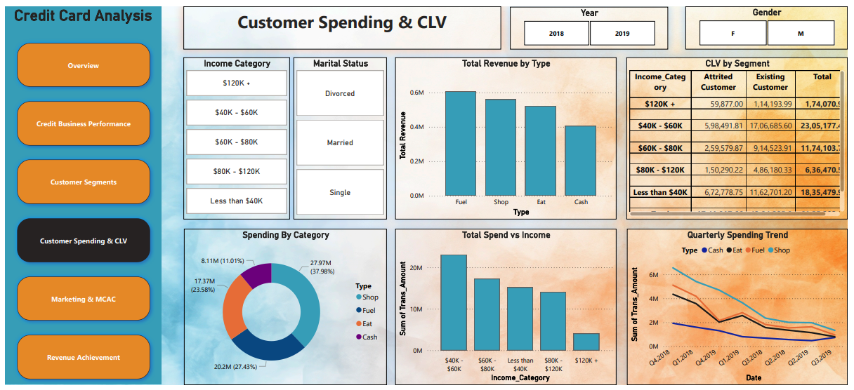
This dashboard provides a comprehensive view of customer spending behavior and their lifetime value. It helps businesses understand which income groups, transaction types, and time periods contribute most to revenue, allowing for better marketing, retention, and strategic planning.
Section-wise Breakdown of Visualizations
1. Bar Chart – Total Revenue by Transaction Type
|
Transaction Type |
Revenue (Approx.) |
|---|---|
|
Fuel |
₹0.6M (Highest) |
|
Shop |
Moderate |
|
Eat |
Moderate |
|
Cash |
Lowest |
Insight:
Fuel-related transactions generate the highest revenue, followed by shopping and dining. This highlights the most profitable spending categories, which can be prioritized for cashback offers, rewards, and co-branded partnerships.
2. Donut Chart – Spending by Category
|
Category |
% of Total Spend |
Total Amount |
|---|---|---|
|
Fuel |
37.98% |
₹27.97M |
|
Shop |
27.43% |
₹20.2M |
|
Eat |
23.58% |
₹17.37M |
|
Cash |
11.01% |
₹8.11M |
Insight:
This chart shows the overall spending distribution across transaction types. It reinforces that fuel purchases dominate customer spending, followed by shopping and food.
Use Case: Create reward programs focused on these top categories to drive loyalty and usage.
3. Bar Chart – Total Spend vs Income Category
|
Income Bracket |
Total Spend |
|---|---|
|
$40K–$60K |
₹22M (Highest) |
|
>$60K |
Decreasing Trend |
|
<$40K |
Lower Spend |
Insight:
The middle-income group ($40K–$60K) is the most valuable in terms of spend. Interestingly, spending decreases as income rises beyond this level, which may indicate cautious spending habits or better credit management among higher earners.
Implication: Target the $40K–$60K group with cross-sell offers, premium features, or loyalty perks.
4. Line Chart – Quarterly Spending Trend (Q4 2018 – Q3 2019)
Trend:
Overall transaction volume shows a declining trend across all categories during the observed period.
Possible Reasons:
-
Economic slowdown
-
Seasonal dips
-
Changing customer behavior or competition
Actionable Tip: Investigate causes and consider seasonal campaigns or customer re-engagement strategies during low-activity quarters.
5. Table – Customer Lifetime Value (CLV) by Segment
|
Income Category |
CLV (Total) |
CLV – Attrited |
CLV – Existing |
|---|---|---|---|
|
$40K–$60K |
₹23.05M |
High |
High |
|
Other Brackets |
Lower |
Varies |
Varies |
Insight:
CLV quantifies the long-term value of customers. The $40K–$60K group again leads, confirming their importance. A high CLV among attrited customers highlights the financial loss from churn.
Use this insight to strengthen retention efforts within this group, such as proactive support, loyalty programs, or credit increases.
6. Filter Options – Interactive Dashboard Controls
Available Filters:
-
Year: 2018 or 2019 – to analyze annual changes
-
Gender
-
Income Category
-
Marital Status
Insight:
These filters enable targeted analysis. For example:
-
How did male customers in the $40K–$60K bracket spend in 2019?
-
Did married customers show higher CLV?
Filters offer personalized data insights that can guide campaign design and strategic decisions.
Purpose of the Dashboard
This dashboard helps in:
-
Identifying high-spending customer segments by income and transaction type
-
Analyzing trends in quarterly spending behavior
-
Evaluating Customer Lifetime Value to prioritize retention
-
Optimizing offerings by focusing on profitable customer behaviors
Conclusion: Businesses can use this information to align marketing, product development, and support with the most valuable customer segments.