Add Summary Stats Using SciPy
Description:
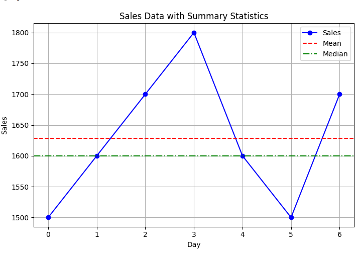
A Python program that calculates and displays summary statistics (mean, median, mode, standard deviation) of sales data using SciPy and visualizes the data with Matplotlib.
Code Explanation:
● Before running this code, install the required package using pip install scipy.
● sales list holds sample sales figures.
● np.mean(sales) computes the average (mean) value.
● np.median(sales) calculates the middle value of sorted sales.
● stats.mode(sales, keepdims=True) finds the most frequent value (mode).
● np.std(sales) returns the standard deviation (spread of data).
● plt.plot() draws the sales trend line with markers.
● plt.axhline() draws horizontal lines for mean and median values.
● plt.legend() adds a legend to the plot, and plt.grid() enables grid lines.
● plt.tight_layout() manages spacing, and plt.show() displays the final chart.
Program:
import matplotlib.pyplot as plt
from scipy import stats
import numpy as np

# Sample sales data
sales = [1500, 1600, 1700, 1800, 1600, 1500, 1700]

# Calculate summary statistics
mean_val = np.mean(sales)
median_val = np.median(sales)
mode_val = stats.mode(sales, keepdims=True)[0][0]
std_dev = np.std(sales)

# Print summary statistics
print(f"Mean: {mean_val}")
print(f"Median: {median_val}")
print(f"Mode: {mode_val}")
print(f"Standard Deviation: {std_dev}")

# Plot sales data
plt.figure(figsize=(8, 5))
plt.plot(sales, marker='o', linestyle='-', color='blue', label='Sales')
plt.axhline(mean_val, color='red', linestyle='--', label='Mean')
plt.axhline(median_val, color='green', linestyle='-.', label='Median')
plt.title('Sales Data with Summary Statistics')
plt.xlabel('Day')
plt.ylabel('Sales')
plt.legend()
plt.grid(True)
plt.tight_layout()
plt.show()
Output: