Display Data Labels on Bars
Description:
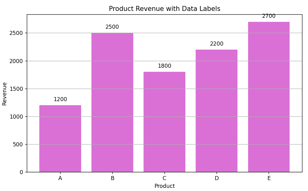
This code displays the revenue of each product directly on top of each bar in a bar chart using matplotlib.
Code Explanation:
🔹 Data Setup:
-
A sample dataset of products and their revenues is created.
-
Converted into a
DataFramewithpandas.
🔹 Bar Plot:
-
plt.bar()creates the vertical bar chart with product names on the x-axis and revenue on the y-axis.
🔹 Adding Data Labels:
-
A loop iterates over each bar object.
-
bar.get_height()gets the height (value) of each bar. -
plt.text()is used to place the label on top of each bar. -
Horizontal alignment (
ha='center') centers the text on the bar. -
Vertical alignment (
va='bottom') places it just above the bar.
🔹 Formatting:
-
Added title, axis labels, gridlines, and used
tight_layout()for a clean layout.
Program:
import pandas as pd
import matplotlib.pyplot as plt

# Sample product revenue data
data = {
    'Product': ['A', 'B', 'C', 'D', 'E'],
    'Revenue': [1200, 2500, 1800, 2200, 2700]
}
df = pd.DataFrame(data)

# Plotting bar chart
plt.figure(figsize=(8, 5))
bars = plt.bar(df['Product'], df['Revenue'], color='orchid')

# Add data labels above bars
for bar in bars:
    height = bar.get_height()
    plt.text(bar.get_x() + bar.get_width()/2, height + 50, f'{height}',
             ha='center', va='bottom', fontsize=10, color='black')

# Formatting
plt.title('Product Revenue with Data Labels')
plt.xlabel('Product')
plt.ylabel('Revenue')
plt.grid(axis='y')
plt.tight_layout()

# Show the plot
plt.show()
Output: