Share X-Axis Across Subplots in Python
Short Description:
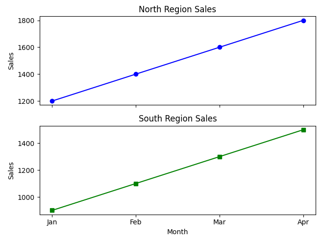
A Python program that displays subplots sharing the x-axis to compare sales trends efficiently across regions.
Code Explanation:
• Imports matplotlib.pyplot for plotting the charts.
• Defines sales data for two regions (North and South) over four months.
• Uses plt.subplots(2, 1, sharex=True) to create two vertically stacked subplots that share the x-axis (month names).
• ax1.plot(...) and ax2.plot(...) plot the sales data for the North and South regions.
• set_title(), set_xlabel(), and set_ylabel() add clear labels and titles to both subplots.
• plt.tight_layout() ensures there’s no overlap between subplots.
• Finally, plt.show() displays both subplots together in a single figure.
Program:
import matplotlib.pyplot as plt

# Sample monthly sales data
months = ['Jan', 'Feb', 'Mar', 'Apr']
north_sales = [1200, 1400, 1600, 1800]
south_sales = [900, 1100, 1300, 1500]

# Create subplots that share the x-axis
fig, (ax1, ax2) = plt.subplots(2, 1, sharex=True, figsize=(6, 5))

# Plot for North region
ax1.plot(months, north_sales, marker='o', color='blue')
ax1.set_title("North Region Sales")
ax1.set_ylabel("Sales")

# Plot for South region
ax2.plot(months, south_sales, marker='s', color='green')
ax2.set_title("South Region Sales")
ax2.set_xlabel("Month")
ax2.set_ylabel("Sales")

# Adjust layout
plt.tight_layout()

# Show the plot
plt.show()
Output: