Format Y-Axis Values as Currency
Description:
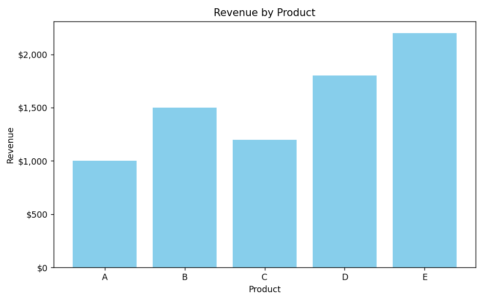
This code creates a bar plot to show revenue for different products and formats the y-axis values as currency.
Code Explanation:
-
First, we import necessary libraries:
-
pandas for data manipulation
-
matplotlib for plotting
-
-
We create a sample DataFrame with products and their respective revenue.
-
A bar chart is plotted using
plt.bar(), where each product's revenue is displayed. -
To format the y-axis values as currency, we use the
FuncFormatterfrom matplotlib. The lambda function formats each value by adding a dollar sign ($) and thousands separator (','). -
We set titles and labels for the chart for better readability.
-
Finally, we display the plot using
plt.show()and adjust the layout usingplt.tight_layout().
Program:
import matplotlib.pyplot as plt
import pandas as pd

# Sample data
data = {
    'Product': ['A', 'B', 'C', 'D', 'E'],
    'Revenue': [1000, 1500, 1200, 1800, 2200]
}

df = pd.DataFrame(data)

# Plotting
plt.figure(figsize=(8, 5))
plt.bar(df['Product'], df['Revenue'], color='skyblue')

# Formatting y-axis as currency
plt.gca().yaxis.set_major_formatter(plt.FuncFormatter(lambda x, loc: f'${x:,.0f}'))

# Title and labels
plt.title('Revenue by Product')
plt.xlabel('Product')
plt.ylabel('Revenue')

# Show plot
plt.tight_layout()
plt.show()
Output: