Handle Missing Data in Plots
Description:
This program demonstrates how to handle missing values (NaN) in a dataset and visualize the effect on line plots using matplotlib and pandas.
Code Explanation:
-
We created sales data that includes
NaN(missing) values. -
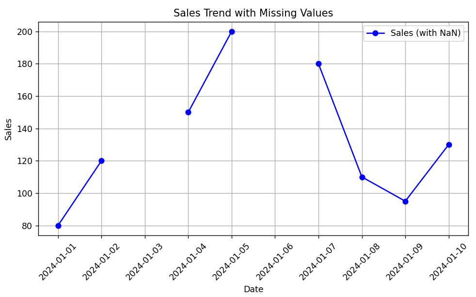
Option 1: If we plot directly,
matplotlibwill skip the missing values and break the line at that point. -
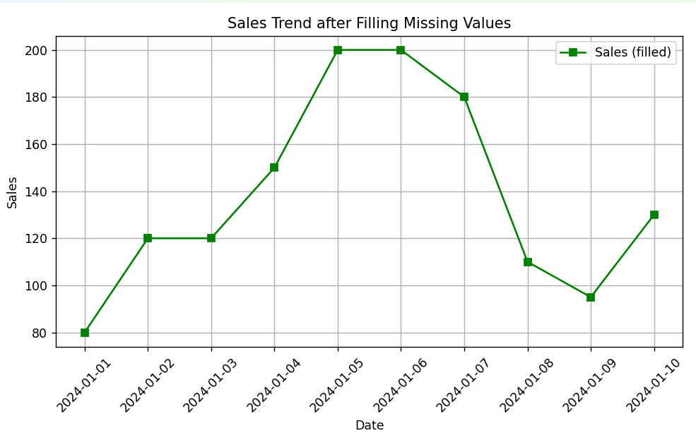
Option 2: We handle missing data using
fillna(method='ffill'), which fills the missing value with the last known value. -
We then plot both versions:
-
One shows breaks (original with NaNs).
-
The other shows a smooth line (after filling missing values).
-
Program:
import matplotlib.pyplot as plt
import pandas as pd
import numpy as np

# Sample data with missing values (NaN)
data = {
    'Date': pd.date_range(start='2024-01-01', periods=10, freq='D'),
    'Sales': [80, 120, np.nan, 150, 200, np.nan, 180, 110, 95, 130]
}
df = pd.DataFrame(data)

# Option 1: Plot with missing values (default behavior)
plt.figure(figsize=(8, 5))
plt.plot(df['Date'], df['Sales'], marker='o', color='blue', label='Sales (with NaN)')
plt.title('Sales Trend with Missing Values')
plt.xlabel('Date')
plt.ylabel('Sales')
plt.xticks(rotation=45)
plt.grid(True)
plt.legend()
plt.tight_layout()
plt.show()

# Option 2: Fill missing values (e.g., with forward fill)
df['Sales_filled'] = df['Sales'].fillna(method='ffill')

# Plot after handling missing values
plt.figure(figsize=(8, 5))
plt.plot(df['Date'], df['Sales_filled'], marker='s', color='green', label='Sales (filled)')
plt.title('Sales Trend after Filling Missing Values')
plt.xlabel('Date')
plt.ylabel('Sales')
plt.xticks(rotation=45)
plt.grid(True)
plt.legend()
plt.tight_layout()
plt.show()
Output:
Output: