Rotate X-axis Labels for Better Readability
Description:
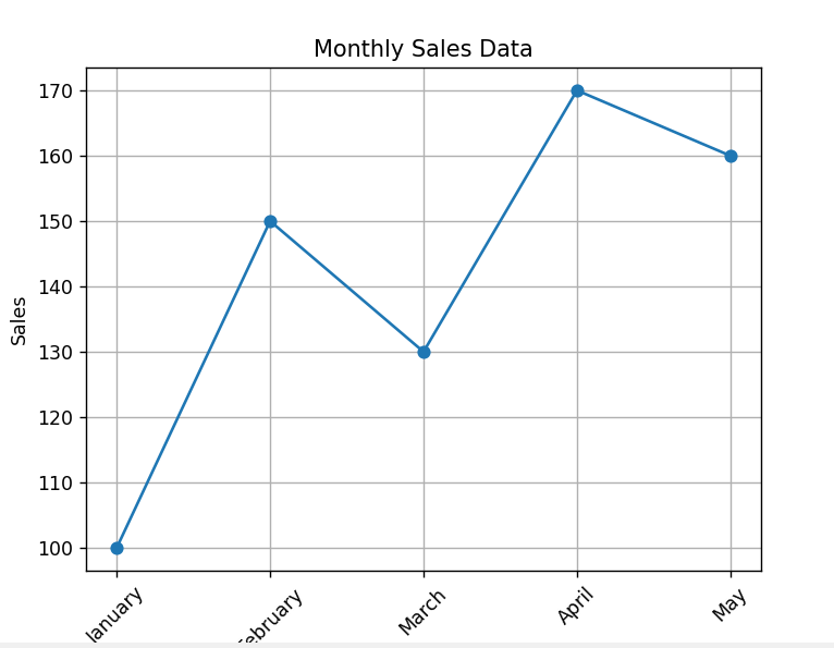
This program rotates the x-axis labels to prevent overlapping and improve the readability of the chart when labels are long or closely spaced.
Code Explanation:
-
xticks(rotation=angle)is used to rotate the x-axis labels. -
Common angles used: 45 or 90 degrees.
-
Helpful when labels are long and overlapping.
-
Improves readability in bar and line charts.
Program:
import matplotlib.pyplot as plt

# Sample data
months = ['January', 'February', 'March', 'April', 'May']
sales = [100, 150, 130, 170, 160]

# Plotting the data
plt.plot(months, sales, marker='o')

# Rotate x-axis labels
plt.xticks(rotation=45)

# Adding title and labels
plt.title('Monthly Sales Data')
plt.xlabel('Month')
plt.ylabel('Sales')

# Display grid
plt.grid(True)

# Show the plot
plt.show()
Output: