Use Twin Axes for Dual Variable Plotting
Description:
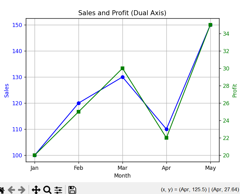
This program creates a plot with two y-axes using twinx() so that two different variables (Sales and Profit) can be visualized on the same x-axis (Months).
Code Explanation:
-
matplotlib.pyplotis used to make the chart. -
monthsis shown on the x-axis. -
salesis plotted on the left y-axis usingax1. -
profitis plotted on a second y-axis usingax2 = ax1.twinx(), which shares the same x-axis. -
Each y-axis has its own label and color for clarity.
-
marker='o'and's'help identify each line visually. -
twinx()is the key function that allows plotting two y-axes in one chart. -
show()displays the chart with both metrics together.
Program:
import matplotlib.pyplot as plt

# Sample data
months = ['Jan', 'Feb', 'Mar', 'Apr', 'May']
sales = [100, 120, 130, 110, 150]         # Variable 1
profit = [20, 25, 30, 22, 35]             # Variable 2

fig, ax1 = plt.subplots()

# Plotting sales on primary y-axis
ax1.plot(months, sales, color='blue', marker='o', label='Sales')
ax1.set_xlabel('Month')
ax1.set_ylabel('Sales', color='blue')
ax1.tick_params(axis='y', labelcolor='blue')

# Creating twin axis for profit
ax2 = ax1.twinx()
ax2.plot(months, profit, color='green', marker='s', label='Profit')
ax2.set_ylabel('Profit', color='green')
ax2.tick_params(axis='y', labelcolor='green')

# Title and grid
plt.title("Sales and Profit (Dual Axis)")
ax1.grid(True)

# Show the plot
plt.show()
Outpuit: