Create a Donut Chart Using Pie and Circle
Description:
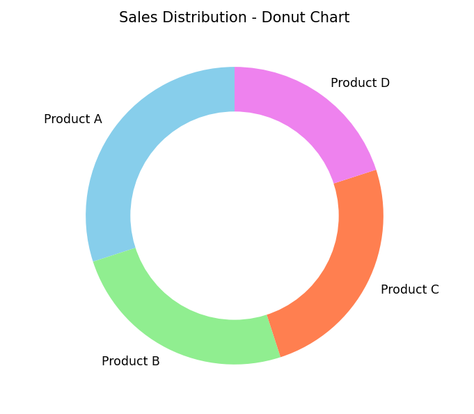
This program creates a donut chart by plotting a pie chart and placing a white circle at the center to give it a "donut" appearance
Code Explanation:
-
A pie chart is made using
pie(). -
A circle is drawn in the center using
plt.Circle()to create a donut shape. -
Gives same info as pie chart but with a modern look.
-
Can be used to show percentage breakdown of categories.
Program:
import matplotlib.pyplot as plt

# Sample data
labels = ['Product A', 'Product B', 'Product C', 'Product D']
sizes = [30, 25, 25, 20]
colors = ['skyblue', 'lightgreen', 'coral', 'violet']

# Create pie chart
plt.pie(sizes, labels=labels, colors=colors, startangle=90, wedgeprops={'width': 0.4})

# Add a circle at the center to make it a donut
centre_circle = plt.Circle((0, 0), 0.70, fc='white')
fig = plt.gcf()
fig.gca().add_artist(centre_circle)

# Add title and display
plt.title('Sales Distribution - Donut Chart')
plt.tight_layout()
plt.show()
Output: