Plot Multiple Charts Using subplot() in 2x2 Grid
Short Description:
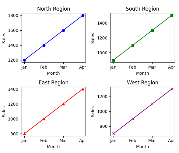
A Python program that displays four different sales charts in a 2x2 grid layout using subplot() for organized visualization.
Code Explanation:
• Imports matplotlib.pyplot for plotting.
• Defines sales data for four regions (North, South, East, West) across four months.
• Uses plt.subplot(2, 2, x) to create a 2x2 grid of subplots, where x ranges from 1 to 4.
• Each subplot contains a line chart for one region's monthly sales.
• Customizes each plot with different markers and colors for distinction.
• Adds titles, x-axis, and y-axis labels for clarity.
• Calls plt.tight_layout() to automatically adjust spacing between subplots.
• Finally, displays the complete figure using plt.show().
Program:
import matplotlib.pyplot as plt

# Sample sales data
months = ['Jan', 'Feb', 'Mar', 'Apr']
north_sales = [1200, 1400, 1600, 1800]
south_sales = [900, 1100, 1300, 1500]
east_sales = [800, 1000, 1200, 1400]
west_sales = [700, 900, 1100, 1300]

# Create a 2x2 grid of subplots
plt.figure(figsize=(6, 5))

# North Region Plot
plt.subplot(2, 2, 1)
plt.plot(months, north_sales, marker='o', color='blue')
plt.title('North Region')
plt.xlabel('Month')
plt.ylabel('Sales')

# South Region Plot
plt.subplot(2, 2, 2)
plt.plot(months, south_sales, marker='s', color='green')
plt.title('South Region')
plt.xlabel('Month')
plt.ylabel('Sales')

# East Region Plot
plt.subplot(2, 2, 3)
plt.plot(months, east_sales, marker='^', color='red')
plt.title('East Region')
plt.xlabel('Month')
plt.ylabel('Sales')

# West Region Plot
plt.subplot(2, 2, 4)
plt.plot(months, west_sales, marker='x', color='purple')
plt.title('West Region')
plt.xlabel('Month')
plt.ylabel('Sales')

# Adjust layout
plt.tight_layout()

# Show the plot
plt.show()
Output: