Compare YOY Growth Using Time Series
Description:
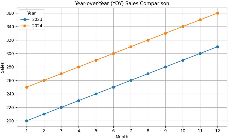
This code compares monthly sales across two years using a line plot to highlight YOY growth patterns.
Code Explanation:
-
Data is created for 24 months (2 years of monthly sales).
-
The sales data is split by year and month.
-
A pivot table helps to place sales from Jan 2023 vs Jan 2024, Feb vs Feb, etc.
-
The line chart shows how each month's performance changed year-over-year.
-
This helps track growth or decline trends across the same time periods.
Program:
import pandas as pd
import matplotlib.pyplot as plt

# Sample data: 2 years of monthly sales
dates = pd.date_range(start='2023-01-01', periods=24, freq='M')
sales = [200 + (i % 12) * 10 + (i // 12) * 50 for i in range(24)]  # Simulated growth

df = pd.DataFrame({'Date': dates, 'Sales': sales})
df['Year'] = df['Date'].dt.year
df['Month'] = df['Date'].dt.month

# Pivot table to compare sales of the same months across years
pivot_df = df.pivot(index='Month', columns='Year', values='Sales')

# Plot
pivot_df.plot(kind='line', marker='o', figsize=(8, 5))

# Formatting
plt.title('Year-over-Year (YOY) Sales Comparison')
plt.xlabel('Month')
plt.ylabel('Sales')
plt.grid(True)
plt.legend(title='Year')
plt.xticks(ticks=range(1, 13))
plt.tight_layout()

# Show the plot
plt.show()
Output: