Highlight Weekends on a Time Series Chart
Description:
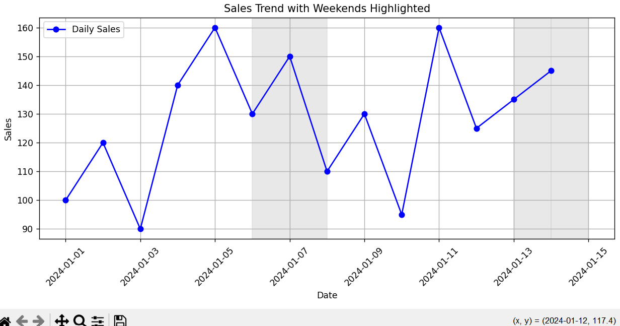
This script plots daily sales data and uses shaded areas to highlight weekends (Saturday & Sunday) on the chart.
Code Explanation:
-
A time series of sales for 14 days is created.
-
plot()is used to draw a line showing sales per day. -
A loop checks which days are Saturday or Sunday using
.weekday(). -
If it’s a weekend,
axvspan()shades the background to highlight those days. -
This helps visually spot patterns related to weekends, like drops or peaks in sales.
Program:
import pandas as pd
import matplotlib.pyplot as plt

# Sample daily sales data including weekdays and weekends
dates = pd.date_range(start='2024-01-01', periods=14, freq='D')
sales = [100, 120, 90, 140, 160, 130, 150, 110, 130, 95, 160, 125, 135, 145]

df = pd.DataFrame({'Date': dates, 'Sales': sales})

# Plotting
plt.figure(figsize=(10, 5))
plt.plot(df['Date'], df['Sales'], marker='o', label='Daily Sales', color='blue')

# Highlight weekends
for i, d in enumerate(df['Date']):
    if d.weekday() >= 5:  # Saturday=5, Sunday=6
        plt.axvspan(d, d + pd.Timedelta(days=1), color='lightgrey', alpha=0.5)

# Formatting
plt.title('Sales Trend with Weekends Highlighted')
plt.xlabel('Date')
plt.ylabel('Sales')
plt.xticks(rotation=45)
plt.grid(True)
plt.legend()
plt.tight_layout()
plt.show()
Output: