Use fill_between for Showing the Area Under the Curve
Description:
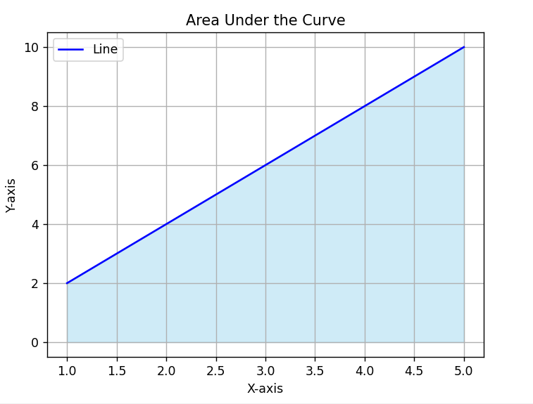
This program plots a line chart and uses fill_between() to highlight the area under the curve with a soft color, making it easy to visualize total or accumulated values.
Code Explanation:
-
matplotlib.pyplotis imported to make charts. -
xandystore the data points for the graph. -
plot()draws the line on the chart. -
fill_between()shades the area between the line and the X-axis. -
This is useful to show total quantity, range, or area under the curve.
-
alpha=0.4makes the fill color semi-transparent. -
legend()andgrid()improve readability. -
show()displays the final chart.
Program:
import matplotlib.pyplot as plt

# Sample data
x = [1, 2, 3, 4, 5]
y = [2, 4, 6, 8, 10]

# Line plot
plt.plot(x, y, label='Line', color='blue')

# Fill area under the curve
plt.fill_between(x, y, color='skyblue', alpha=0.4)

# Labels and title
plt.title('Area Under the Curve')
plt.xlabel('X-axis')
plt.ylabel('Y-axis')

# Show plot
plt.legend()
plt.grid(True)
plt.show()
Output: