Overlay a Trend Line on a Scatter Plot
Description:
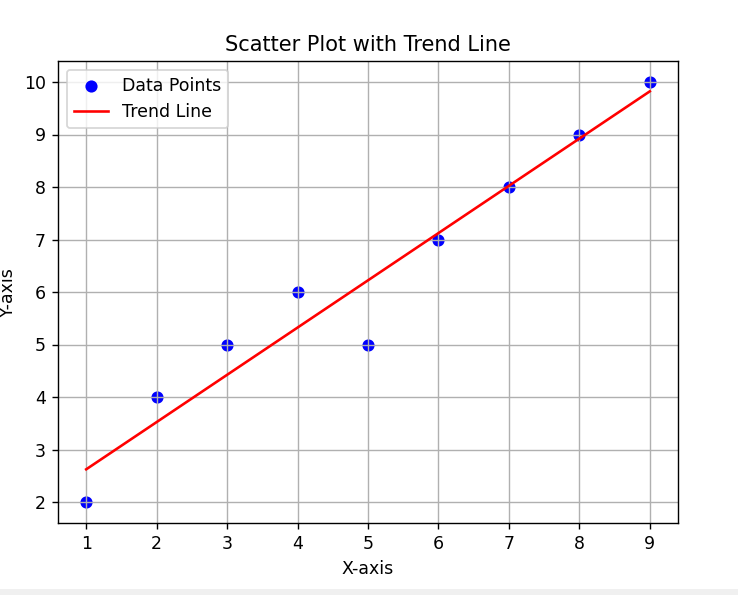
This program creates a scatter plot and overlays a trend line (also called a regression line) to show the general direction or relationship between two variables.
Code Explanation:
-
fill_between()fills the area between a line and a baseline. -
Can be used to shade areas of interest like high or low ranges.
-
Often used for confidence intervals or highlighting patterns.
-
Makes the graph more informative visually.
Program:
import matplotlib.pyplot as plt
import numpy as np

# Sample data (e.g., marketing spend vs sales)
x = np.array([1, 2, 3, 4, 5, 6, 7, 8, 9])
y = np.array([2, 4, 5, 6, 5, 7, 8, 9, 10])

# Scatter plot
plt.scatter(x, y, color='blue', label='Data Points')

# Calculate and plot trend line
z = np.polyfit(x, y, 1)           # 1st-degree polynomial (linear trend)
p = np.poly1d(z)                  # Polynomial object
plt.plot(x, p(x), color='red', label='Trend Line')  # Red trend line

# Add title and labels
plt.title('Scatter Plot with Trend Line')
plt.xlabel('X-axis')
plt.ylabel('Y-axis')
plt.legend()
plt.grid(True)

# Show plot
plt.show()
Output: