Generate a Scatter Plot Between Unit Price and Units Sold
Description:
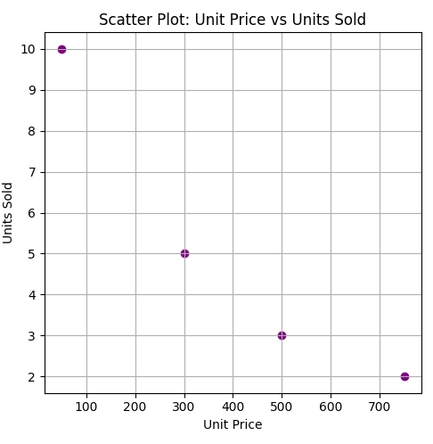
This program generates a scatter plot to visualize the relationship between unit price and units sold (quantity)
Code Explanation:
● Created a DataFrame from the sales data containing unit prices and quantities.
● Used plt.scatter() to draw a scatter plot comparing Price and Quantity.
● Set 'Price' on the X-axis and 'Quantity' on the Y-axis.
● Colored the dots purple for visual distinction.
● Added axis labels and a title to describe the plot.
● Enabled gridlines and used tight_layout() to organize spacing.
Program:
import matplotlib.pyplot as plt
import pandas as pd

# Sample data
data = {
    'OrderID': [101, 102, 103, 104],
    'Product': ['Laptop', 'Tablet', 'Smartphone', 'Headphones'],
    'Quantity': [2, 5, 3, 10],
    'Price': [750, 300, 500, 50],
    'Date': ['2025-01-01', '2025-01-01', '2025-01-02', '2025-01-02']
}

# Create DataFrame
df = pd.DataFrame(data)

# Plotting the scatter plot
plt.figure(figsize=(8, 5))
plt.scatter(df['Price'], df['Quantity'], color='purple')
plt.title('Scatter Plot: Unit Price vs Units Sold')
plt.xlabel('Unit Price')
plt.ylabel('Units Sold')
plt.grid(True)
plt.tight_layout()
plt.show()
Output: