Combine Matplotlib with Seaborn
Description:
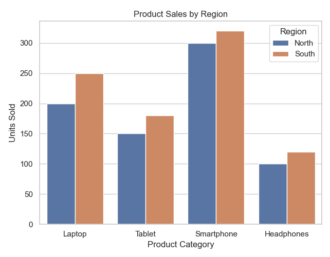
A Python program that uses both Seaborn and Matplotlib to create enhanced and customized data visualizations.
Code Explanation:
● sns.set(style="whitegrid") sets a clean Seaborn style.
● sns.barplot() is used to create a grouped bar chart using Seaborn.
● hue='Region' splits bars by region for comparison.
● plt.title(), plt.xlabel(), and plt.ylabel() are from Matplotlib to enhance the plot.
● plt.tight_layout() improves spacing before displaying the plot.
Program:
import matplotlib.pyplot as plt
import seaborn as sns
import pandas as pd

# Sample Data
data = {
    'Product': ['Laptop', 'Tablet', 'Smartphone', 'Headphones', 'Laptop', 'Tablet', 'Smartphone', 'Headphones'],
    'Region': ['North', 'North', 'North', 'North', 'South', 'South', 'South', 'South'],
    'Sales': [200, 150, 300, 100, 250, 180, 320, 120]
}
df = pd.DataFrame(data)

# Set seaborn theme
sns.set(style="whitegrid")

# Create a seaborn barplot
plt.figure(figsize=(6, 5))
sns.barplot(data=df, x='Product', y='Sales', hue='Region')

# Customize using matplotlib
plt.title("Product Sales by Region")
plt.xlabel("Product Category")
plt.ylabel("Units Sold")
plt.legend(title="Region")
plt.tight_layout()

# Show the plot
plt.show()
Output: