Customize Subplot Sizes Using GridSpec
Description:
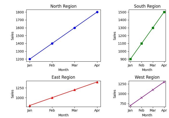
A Python program that uses gridspec to control the sizes of individual subplots for better customization of the plot layout.
Code Explanation:
• Imports matplotlib.pyplot for plotting and matplotlib.gridspec for custom subplot layouts.
• Defines sales data for four regions (North, South, East, West) across four months (Jan, Feb, Mar, Apr).
• Uses gridspec.GridSpec(2, 2) to create a 2x2 grid layout with custom height and width ratios to control subplot sizes.
- height_ratios=[2, 1] makes the top row (North and South regions) twice as tall as the bottom row (East and West regions).
- width_ratios=[2, 1] makes the left column (North and East regions) twice as wide as the right column (South and West regions).
• Creates subplots using fig.add_subplot() and places them in the grid as defined by gs.
• Plots the sales data for each region on its respective subplot.
• Adds titles and axis labels for each subplot.
• Uses plt.tight_layout() to adjust spacing and avoid overlap between subplots.
• Finally, plt.show() displays the figure.
Program:
import matplotlib.pyplot as plt
import matplotlib.gridspec as gridspec

# Sample sales data
regions = ['North', 'South', 'East', 'West']
sales = {
    'North': [1200, 1400, 1600, 1800],
    'South': [900, 1100, 1300, 1500],
    'East': [800, 1000, 1200, 1400],
    'West': [700, 900, 1100, 1300]
}
months = ['Jan', 'Feb', 'Mar', 'Apr']

# Create a gridspec with specific subplot sizes
fig = plt.figure(figsize=(5, 5))
gs = gridspec.GridSpec(2, 2, height_ratios=[2, 1], width_ratios=[2, 1])

# Create subplots using the gridspec layout
ax1 = fig.add_subplot(gs[0, 0])
ax1.plot(months, sales['North'], color='blue', marker='o')
ax1.set_title('North Region')
ax1.set_xlabel('Month')
ax1.set_ylabel('Sales')

ax2 = fig.add_subplot(gs[0, 1])
ax2.plot(months, sales['South'], color='green', marker='s')
ax2.set_title('South Region')
ax2.set_xlabel('Month')
ax2.set_ylabel('Sales')

ax3 = fig.add_subplot(gs[1, 0])
ax3.plot(months, sales['East'], color='red', marker='^')
ax3.set_title('East Region')
ax3.set_xlabel('Month')
ax3.set_ylabel('Sales')

ax4 = fig.add_subplot(gs[1, 1])
ax4.plot(months, sales['West'], color='purple', marker='x')
ax4.set_title('West Region')
ax4.set_xlabel('Month')
ax4.set_ylabel('Sales')

# Adjust layout
plt.tight_layout()

# Show the plot
plt.show()
Output: