Use Matplotlib.dates for Time Formatting
Description:
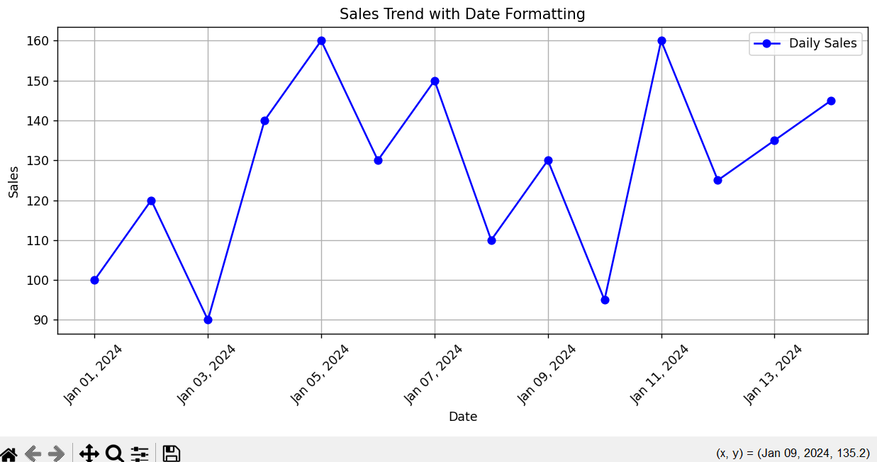
This script formats the x-axis dates in a readable format using matplotlib.dates.
Explanation:
-
We plot the sales data over time.
-
The
mdates.DateFormatter()function frommatplotlib.datesis used to customize how the dates are displayed on the x-axis. -
The format
%b %d, %Ymeans abbreviated month name, day, and year (e.g., Jan 01, 2024). -
This makes the dates more readable and clear for time-series data.
Program:
import pandas as pd
import matplotlib.pyplot as plt
import matplotlib.dates as mdates

# Sample daily sales data
dates = pd.date_range(start='2024-01-01', periods=14, freq='D')
sales = [100, 120, 90, 140, 160, 130, 150, 110, 130, 95, 160, 125, 135, 145]
df = pd.DataFrame({'Date': dates, 'Sales': sales})

# Plot sales trend
plt.figure(figsize=(10, 5))
plt.plot(df['Date'], df['Sales'], marker='o', label='Daily Sales', color='blue')

# Format the x-axis to display the dates in a specific format using matplotlib.dates
plt.gca().xaxis.set_major_formatter(mdates.DateFormatter('%b %d, %Y'))

# Formatting
plt.title('Sales Trend with Date Formatting')
plt.xlabel('Date')
plt.ylabel('Sales')
plt.xticks(rotation=45)
plt.grid(True)
plt.legend()
plt.tight_layout()

# Show the plot
plt.show()
Output: