Mark Special Sales Events or Holidays
Description:
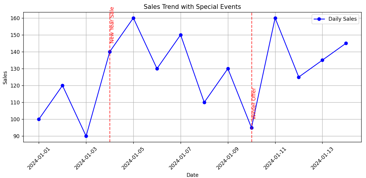
This script plots daily sales and marks special events or holidays (e.g., "New Year Sale") on the chart using vertical dashed lines and labels.
Explanation:
-
A line chart shows sales for 14 days.
-
A dictionary stores special sales events and their dates.
-
For each special event:
-
A dashed red line is drawn on that date.
-
A label is added above the sales point to describe the event (like “New Year Sale”).
-
-
This helps highlight important sales boosts or drops linked to events or promotions.
Program:
import pandas as pd
import matplotlib.pyplot as plt

# Sample daily sales data
dates = pd.date_range(start='2024-01-01', periods=14, freq='D')
sales = [100, 120, 90, 140, 160, 130, 150, 110, 130, 95, 160, 125, 135, 145]
df = pd.DataFrame({'Date': dates, 'Sales': sales})

# Define special events (e.g., holiday sales or promotions)
special_events = {
    '2024-01-04': 'New Year Sale',
    '2024-01-10': 'Winter Offer'
}

# Plot sales trend
plt.figure(figsize=(10, 5))
plt.plot(df['Date'], df['Sales'], marker='o', label='Daily Sales', color='blue')

# Highlight and annotate special events
for date_str, label in special_events.items():
    date = pd.to_datetime(date_str)
    sale_value = df.loc[df['Date'] == date, 'Sales'].values[0]
    plt.axvline(x=date, color='red', linestyle='--', alpha=0.7)
    plt.text(date, sale_value + 5, label, rotation=90, verticalalignment='bottom', color='red')

# Formatting
plt.title('Sales Trend with Special Events')
plt.xlabel('Date')
plt.ylabel('Sales')
plt.xticks(rotation=45)
plt.grid(True)
plt.legend()
plt.tight_layout()
plt.show()
Output: