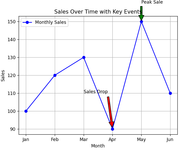
Use Annotations to Highlight Key Events in Time Series
Description:
This program plots a time series line chart and uses annotations to highlight important events (e.g., spikes, drops, or milestones).
Code Explanation:
-
annotate()adds text at specific data points. -
Used to point out important events (like promotions or spikes).
-
An arrow or label improves chart storytelling.
-
Helps users understand sudden changes in data.
Program:
import matplotlib.pyplot as plt

# Sample time series data
months = ['Jan', 'Feb', 'Mar', 'Apr', 'May', 'Jun']
sales = [100, 120, 130, 90, 150, 110]

# Plotting the line chart
plt.plot(months, sales, marker='o', color='blue', label='Monthly Sales')

# Annotate the highest point
max_value = max(sales)
max_index = sales.index(max_value)
plt.annotate('Peak Sale',
             xy=(months[max_index], max_value),
             xytext=(months[max_index], max_value + 10),
             arrowprops=dict(facecolor='green', shrink=0.05))

# Annotate a drop
plt.annotate('Sales Drop',
             xy=('Apr', 90),
             xytext=('Mar', 110),
             arrowprops=dict(facecolor='red', shrink=0.05))

# Add title and labels
plt.title('Sales Over Time with Key Events')
plt.xlabel('Month')
plt.ylabel('Sales')
plt.grid(True)
plt.legend()

# Show plot
plt.show()
Output: