Use Custom Fonts in Titles and Labels
Description:
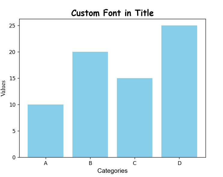
This program displays a bar chart and applies custom fonts to the title and axis labels using the fontname, fontsize, and fontweight parameters.
Code Explanation:
-
matplotlib.pyplotis used to plot the chart. -
Sample categories and values are used to draw a bar graph.
-
plt.title()sets the chart's title using a custom font (e.g., Comic Sans MS), and adds size and bold weight. -
plt.xlabel()andplt.ylabel()use different fonts for x and y labels. -
fontnamelets you change the style of the text (e.g., Arial, Times New Roman). -
fontsizecontrols the size, andfontweightadds emphasis (bold). -
Finally,
plt.show()displays the customized chart.
Program:
import matplotlib.pyplot as plt

# Sample data
categories = ['A', 'B', 'C', 'D']
values = [10, 20, 15, 25]

# Create bar chart
plt.bar(categories, values, color='skyblue')

# Add custom font styles
plt.title('Custom Font in Title', fontname='Comic Sans MS', fontsize=16, fontweight='bold')
plt.xlabel('Categories', fontname='Arial', fontsize=12)
plt.ylabel('Values', fontname='Times New Roman', fontsize=12)

# Show the plot
plt.show()
Output: