Use groupby() and agg() Before Plotting
Description:
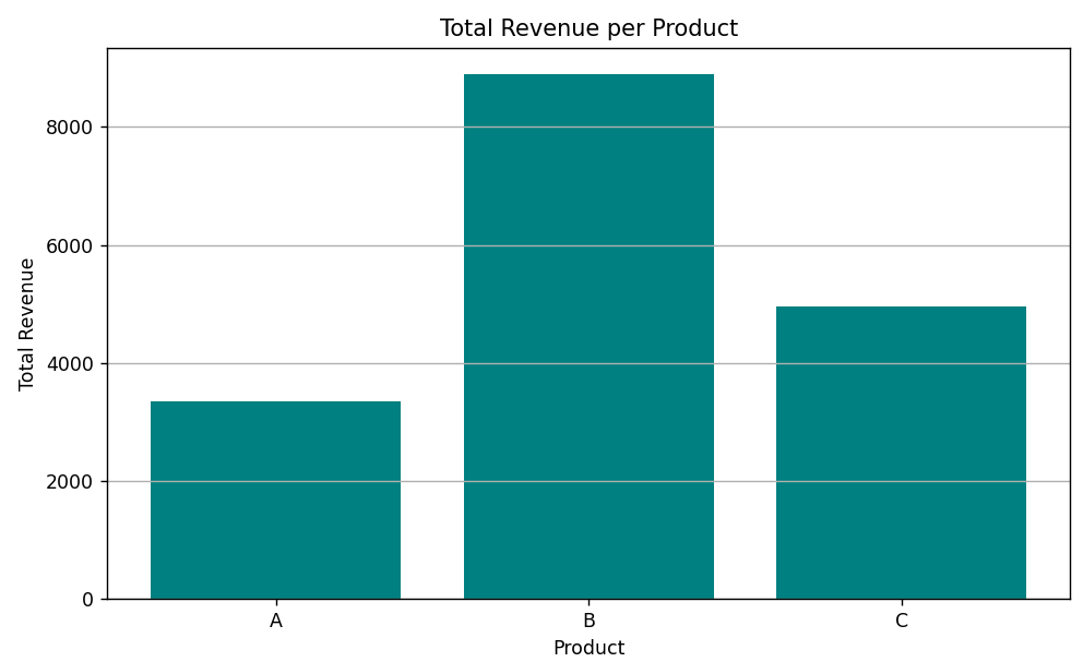
This code demonstrates how to aggregate data using groupby() and agg() in pandas to compute total sales and revenue per product, and then visualize it with a bar chart.
Code Explanation:
-
First, we create a DataFrame using sample sales and revenue data for different products.
-
Then, we use
groupby()to group the data by the product name. -
After grouping, we use
.agg()to calculate the total sales and total revenue for each product. -
This gives us a summary table showing total sales and revenue for products A, B, and C.
-
We then use matplotlib to create a bar chart to show the total revenue per product.
-
The chart helps us compare which product made the most revenue overall.
-
This method is very useful when working with large data that needs to be summarized before visualizing.
Program:
import pandas as pd
import matplotlib.pyplot as plt

# Sample transactional data
data = {
    'Product': ['A', 'B', 'A', 'C', 'B', 'C', 'A', 'B', 'C'],
    'Sales': [100, 200, 150, 100, 250, 200, 130, 220, 180],
    'Revenue': [1000, 3000, 1200, 900, 3100, 2100, 1150, 2800, 1950]
}

df = pd.DataFrame(data)

# Grouping by product and aggregating
grouped = df.groupby('Product').agg({
    'Sales': 'sum',
    'Revenue': 'sum'
}).reset_index()

# Plotting total revenue per product
plt.figure(figsize=(8, 5))
plt.bar(grouped['Product'], grouped['Revenue'], color='teal')

# Formatting
plt.title('Total Revenue per Product')
plt.xlabel('Product')
plt.ylabel('Total Revenue')
plt.grid(axis='y')
plt.tight_layout()

# Show the plot
plt.show()
Output: