Plot Total Revenue Over Time
Description:
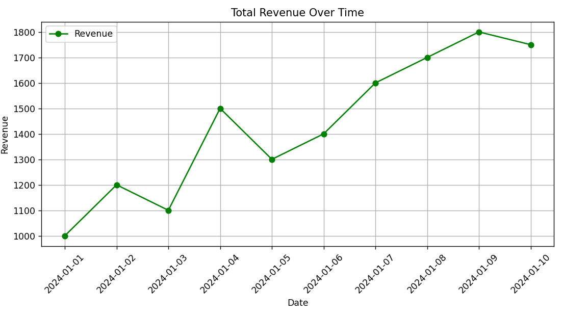
This script creates a line chart to display how total revenue changes over time, using dates and revenue values.
Code Explanation:
-
A dataset is created with daily revenue values for 10 days.
-
plot()is used to draw a line graph of revenue against time. -
X-axis shows the dates, and Y-axis shows revenue.
-
Markers and lines help track revenue trend clearly.
-
Useful to visualize growth or decline in sales over a period.
Program:
import pandas as pd
import matplotlib.pyplot as plt

# Sample data: Dates and Revenue
data = {
    'Date': pd.date_range(start='2024-01-01', periods=10, freq='D'),
    'Revenue': [1000, 1200, 1100, 1500, 1300, 1400, 1600, 1700, 1800, 1750]
}

df = pd.DataFrame(data)

# Plotting revenue over time
plt.figure(figsize=(9, 5))
plt.plot(df['Date'], df['Revenue'], color='green', marker='o', linestyle='-', label='Revenue')

# Formatting
plt.title('Total Revenue Over Time')
plt.xlabel('Date')
plt.ylabel('Revenue')
plt.xticks(rotation=45)
plt.grid(True)
plt.legend()
plt.tight_layout()

# Show the plot
plt.show()
Output: