Customize the Color of a Line Chart
Description:
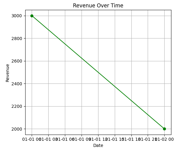
This program plots a customized line chart of daily revenue with colored lines, markers, and improved readability features.
Code Explanation:
● Converted 'Date' column to datetime format using pd.to_datetime().
● Calculated 'Revenue' by multiplying Quantity and Price.
● Grouped data by 'Date' to get total revenue per day.
● Used plt.plot() to create a line chart of revenue over time.
● Customized line color using color='green', added marker='o' for dots, and linestyle='-'.
● Added grid, title, and axis labels for better readability.
Program:
import matplotlib.pyplot as plt
import pandas as pd

# Sample data
data = {
    'OrderID': [101, 102, 103, 104],
    'Product': ['Laptop', 'Tablet', 'Smartphone', 'Headphones'],
    'Quantity': [2, 5, 3, 10],
    'Price': [750, 300, 500, 50],
    'Date': ['2025-01-01', '2025-01-01', '2025-01-02', '2025-01-02']
}

# Create DataFrame
df = pd.DataFrame(data)

# Convert Date column to datetime
df['Date'] = pd.to_datetime(df['Date'])

# Calculate Revenue
df['Revenue'] = df['Quantity'] * df['Price']

# Group by Date
revenue_by_date = df.groupby('Date')['Revenue'].sum()

# Plotting the line chart with a custom color
plt.figure(figsize=(8, 5))
plt.plot(revenue_by_date.index, revenue_by_date.values, color='green', marker='o', linestyle='-')
plt.title('Revenue Over Time')
plt.xlabel('Date')
plt.ylabel('Revenue')
plt.grid(True)
plt.tight_layout()
plt.show()
Output: