Visualize Null Value Patterns
Description:
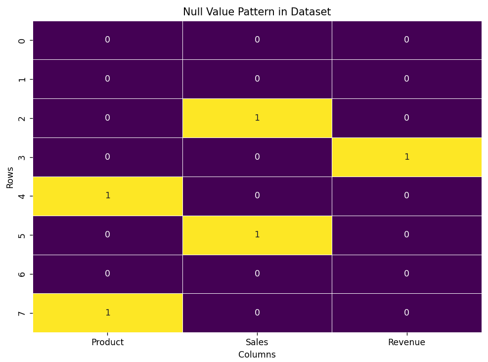
This code visualizes the pattern of missing (null) values in a dataset using a heatmap. It highlights where the null values are located, helping identify areas that may need data cleaning or imputation.
Code Explanation:
-
First, we import the necessary libraries, pandas for data manipulation and matplotlib for visualization.
-
We create a sample DataFrame that contains some null values (NaN) in the dataset.
-
Using the
.isnull()function, we can identify null values in the DataFrame. -
Then, we use
matplotlibto visualize these null values in a heatmap. -
The heatmap uses colors to highlight where the null values are located in the dataset.
-
This makes it easier to understand the pattern of missing data in different columns.
-
Null value visualization is important because it helps identify columns or rows with significant missing data, guiding decisions on how to handle them (e.g., imputation or removal).
Program:
import pandas as pd
import matplotlib.pyplot as plt
import seaborn as sns

# Sample data with missing values
data = {
    'Product': ['A', 'B', 'C', 'D', None, 'E', 'F', None],
    'Sales': [200, 150, None, 300, 250, None, 400, 100],
    'Revenue': [5000, 4000, 3000, None, 4500, 3500, 6000, 2000]
}

df = pd.DataFrame(data)

# Visualizing missing values using a heatmap
plt.figure(figsize=(8, 6))
sns.heatmap(df.isnull(), cbar=False, cmap='viridis', annot=True, fmt="d", linewidths=0.5)

# Title and labels
plt.title('Null Value Pattern in Dataset')
plt.xlabel('Columns')
plt.ylabel('Rows')

# Show the plot
plt.tight_layout()
plt.show()
Output: