Make a Polar Plot for Seasonal Sales
Description:
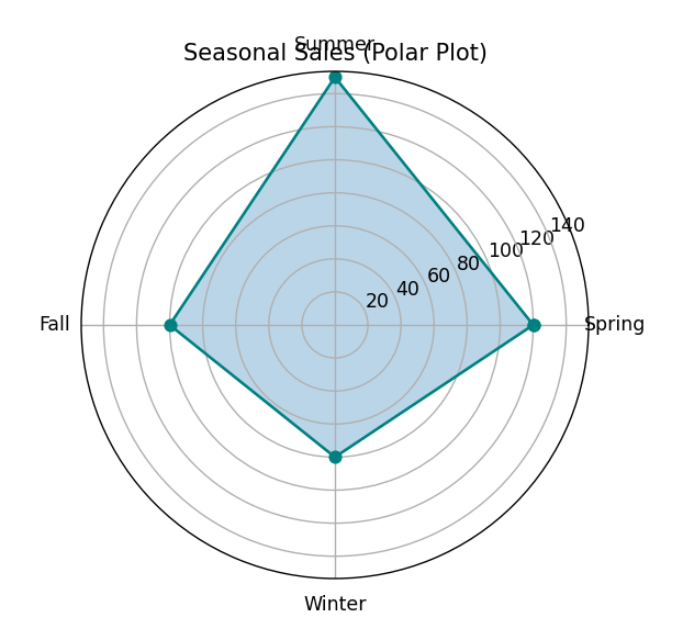
This program creates a polar chart to visualize seasonal sales data in a circular format using angles for each season.
Code Explanation:
-
matplotlib.pyplotandnumpyare used for plotting and calculations. -
seasonsare converted to angles around a circle usingnp.linspace(). -
The sales data is made circular by repeating the first value at the end.
-
subplot_kw={'projection': 'polar'}sets the chart to polar type. -
ax.plot()draws the sales trend in a circular format. -
ax.fill()colors the area under the curve to highlight it. -
set_xticklabels()assigns season names to directions on the polar axis. -
show()displays the circular seasonal sales chart.
Program:
import matplotlib.pyplot as plt
import numpy as np

# Seasonal sales data
seasons = ['Spring', 'Summer', 'Fall', 'Winter']
sales = [120, 150, 100, 80]

# Convert categories to angles in radians
angles = np.linspace(0, 2 * np.pi, len(seasons), endpoint=False)

# Complete the loop
sales += sales[:1]
angles = np.append(angles, angles[0])

# Create polar plot
fig, ax = plt.subplots(subplot_kw={'projection': 'polar'})
ax.plot(angles, sales, color='teal', marker='o')
ax.fill(angles, sales, alpha=0.3)

# Set the labels
ax.set_xticks(angles[:-1])
ax.set_xticklabels(seasons)
ax.set_title("Seasonal Sales (Polar Plot)")

# Show the plot
plt.show()
Output: