Plot Daily Sales Trends
Description:
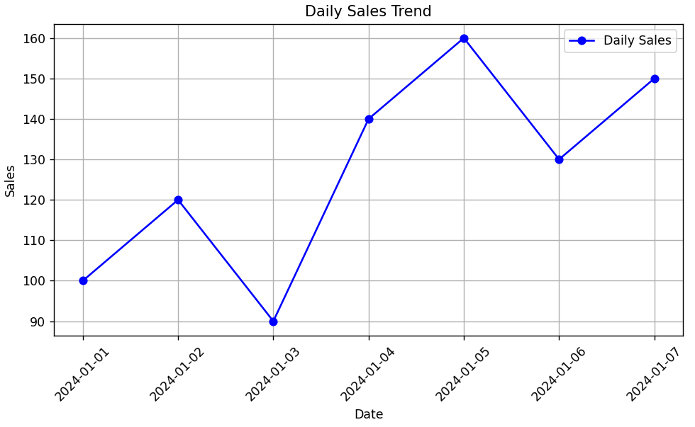
This script plots a line chart to visualize daily sales over a 7-day period using Date as the X-axis and Sales as the Y-axis.
Code Explanation:
-
pandascreates a DataFrame with 7 days of sales data. -
matplotlib.pyplotis used to plot the data as a line chart. -
plt.plot()connects daily sales values with a blue line and round markers. -
marker='o'shows dots for each day's value. -
xticks(rotation=45)rotates date labels to avoid overlap. -
plt.tight_layout()automatically adjusts spacing so labels don’t get cut off. -
plt.show()displays the final plot on screen.
Program:
import pandas as pd
import matplotlib.pyplot as plt  # Add this line

# Sample daily sales data
data = {
    'Date': pd.date_range(start='2024-01-01', periods=7, freq='D'),
    'Sales': [100, 120, 90, 140, 160, 130, 150]
}

df = pd.DataFrame(data)

# Plotting daily sales trend
plt.figure(figsize=(8, 5))
plt.plot(df['Date'], df['Sales'], marker='o', linestyle='-', color='blue', label='Daily Sales')

# Formatting
plt.title('Daily Sales Trend')
plt.xlabel('Date')
plt.ylabel('Sales')
plt.xticks(rotation=45)
plt.grid(True)
plt.legend()
plt.tight_layout()

# Show the plot
plt.show()
Output: