Group Sales by Month and Plot the Results
Description:
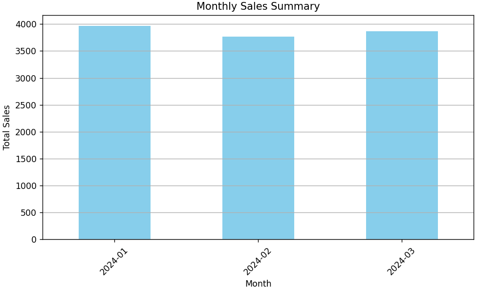
This code groups daily sales data by month and plots the total monthly sales using a bar chart.
Code Explanation:
-
A DataFrame is created with 90 days of sales.
-
The
Dateis converted to monthly periods using.dt.to_period('M'). -
groupby()andsum()are used to calculate monthly totals. -
plot(kind='bar')creates a bar chart to show sales per month. -
This helps in comparing overall performance of different months easily.
Program:
import pandas as pd
import matplotlib.pyplot as plt

# Sample sales data with multiple months
data = {
    'Date': pd.date_range(start='2024-01-01', periods=90, freq='D'),
    'Sales': [100 + (x % 30) * 2 for x in range(90)]  # Sample sales pattern
}

df = pd.DataFrame(data)

# Convert Date column to datetime and extract month
df['Month'] = df['Date'].dt.to_period('M')

# Group by month and calculate total sales
monthly_sales = df.groupby('Month')['Sales'].sum()

# Plotting
plt.figure(figsize=(8, 5))
monthly_sales.plot(kind='bar', color='skyblue')

# Formatting
plt.title('Monthly Sales Summary')
plt.xlabel('Month')
plt.ylabel('Total Sales')
plt.xticks(rotation=45)
plt.grid(axis='y')
plt.tight_layout()

# Show the plot
plt.show()
Output: