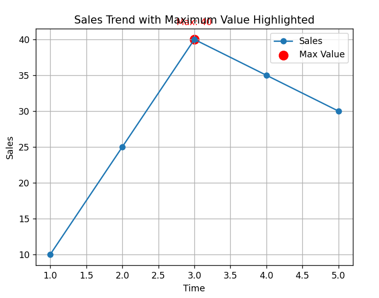
Highlight Maximum Values on a Line Chart
Description:
This program plots a line chart and highlights the maximum value using a colored marker and an annotation to make it stand out.
Code Explanation:
-
The maximum value is found using
max()and its position usingindex(). -
annotate()ortext()is used to highlight that point. -
A marker (like a circle or star) is added on the max point.
-
This visually emphasizes important data points for the viewer.
Program:
import matplotlib.pyplot as plt

# Sample data
x = [1, 2, 3, 4, 5]
y = [10, 25, 40, 35, 30]

# Plot the line chart
plt.plot(x, y, marker='o', label='Sales')

# Find the maximum value and its position
max_value = max(y)
max_index = y.index(max_value)
max_x = x[max_index]

# Highlight the maximum point
plt.scatter(max_x, max_value, color='red', s=100, label='Max Value')
plt.text(max_x, max_value + 2, f'Max: {max_value}', ha='center', color='red')

# Add title and labels
plt.title('Sales Trend with Maximum Value Highlighted')
plt.xlabel('Time')
plt.ylabel('Sales')

# Show legend and grid
plt.legend()
plt.grid(True)

# Display the plot
plt.show()
Output: