Overlay Pandas Plots with Matplotlib
Description:
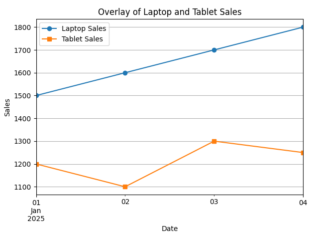
A Python program that overlays multiple Pandas plots on a single Matplotlib chart for comparative analysis.
Code Explanation:
● pd.date_range() creates a sequence of dates for the 'Date' column.
● Sales data for 'Laptop' and 'Tablet' is stored in a dictionary and converted to a DataFrame.
● df.set_index('Date', inplace=True) sets the date as the x-axis for plotting.
● df['Laptop'].plot() and df['Tablet'].plot() overlay both plots on the same chart.
● label and marker help differentiate between the series visually.
● plt.title(), plt.xlabel(), and plt.ylabel() provide context to the chart.
● plt.legend() displays labels for clarity.
● plt.grid(True) adds helpful grid lines.
Program:
import pandas as pd
import matplotlib.pyplot as plt

# Sample DataFrame
data = {
    'Date': pd.date_range(start='2025-01-01', periods=4, freq='D'),
    'Laptop': [1500, 1600, 1700, 1800],
    'Tablet': [1200, 1100, 1300, 1250]
}
df = pd.DataFrame(data)

# Set 'Date' as index
df.set_index('Date', inplace=True)

# Plot using Pandas (which uses Matplotlib under the hood)
df['Laptop'].plot(label='Laptop Sales', marker='o')
df['Tablet'].plot(label='Tablet Sales', marker='s')

# Add titles and labels
plt.title("Overlay of Laptop and Tablet Sales")
plt.xlabel("Date")
plt.ylabel("Sales")
plt.legend()
plt.grid(True)

# Show the plot
plt.tight_layout()
plt.show()
Output: