Customize Tick Marks on the X-axis
Description:
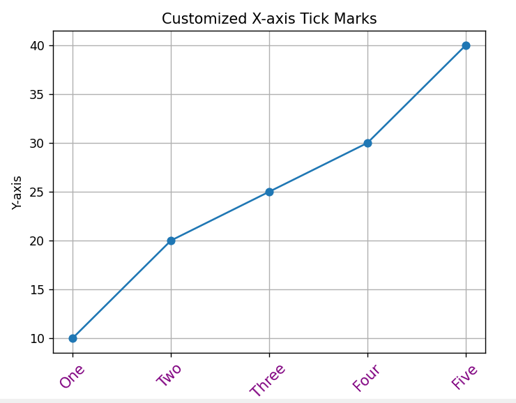
This program customizes the tick marks on the x-axis. You can set the tick locations, tick labels, and their appearance to make the chart more readable and visually appealing.
Code Explanation:
-
xticks()is used to set custom values on the X-axis. -
You can change the position, labels, and rotation of ticks.
-
Useful when your data has specific categories (like days, months).
-
Makes the chart easier to understand for viewers.
Program:
import matplotlib.pyplot as plt

# Data for plotting
x = [1, 2, 3, 4, 5]
y = [10, 20, 25, 30, 40]

# Create the plot
plt.plot(x, y, marker='o')

# Customize the tick marks on the x-axis
plt.xticks(ticks=[1, 2, 3, 4, 5], labels=['One', 'Two', 'Three', 'Four', 'Five'], rotation=45, fontsize=12, color='purple')

# Adding title and labels
plt.title('Customized X-axis Tick Marks')
plt.xlabel('X-axis')
plt.ylabel('Y-axis')

# Show grid
plt.grid(True)

# Show the plot
plt.show()
Output: