Show a Moving Average on a Line Chart
Description:
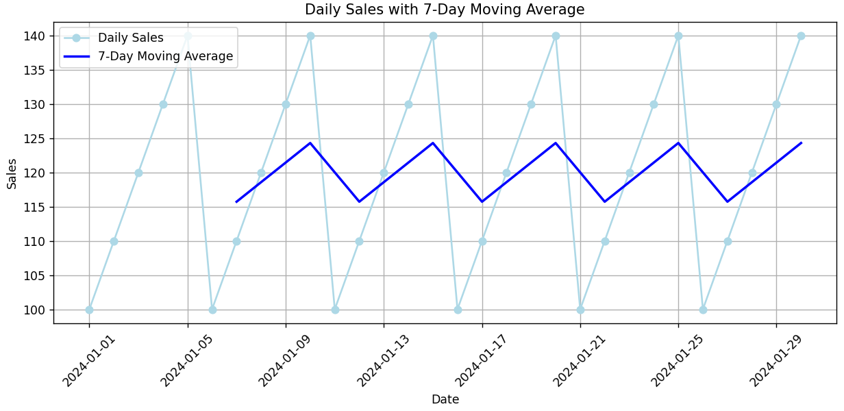
This program displays a daily sales line chart and overlays a 7-day moving average line to smooth out short-term fluctuations.
Explanation:
-
A DataFrame with 30 days of sales is created.
-
.rolling(window=7).mean()calculates the average of the last 7 days for each point. -
The chart shows both:
-
The original daily sales (jumpy/irregular).
-
The moving average (smooth trend line).
-
-
This makes it easier to see long-term patterns and avoid noise from daily variations.
Program:
import pandas as pd
import matplotlib.pyplot as plt

# Sample daily sales data
data = {
    'Date': pd.date_range(start='2024-01-01', periods=30, freq='D'),
    'Sales': [100 + (x % 5) * 10 for x in range(30)]
}
df = pd.DataFrame(data)

# Calculate 7-day moving average
df['7-Day MA'] = df['Sales'].rolling(window=7).mean()

# Plotting the original sales and moving average
plt.figure(figsize=(10, 5))
plt.plot(df['Date'], df['Sales'], label='Daily Sales', color='lightblue', marker='o')
plt.plot(df['Date'], df['7-Day MA'], label='7-Day Moving Average', color='blue', linewidth=2)

# Formatting
plt.title('Daily Sales with 7-Day Moving Average')
plt.xlabel('Date')
plt.ylabel('Sales')
plt.xticks(rotation=45)
plt.legend()
plt.grid(True)
plt.tight_layout()

# Show the plot
plt.show()
Output: