Format Values in Axis Labels
Description:
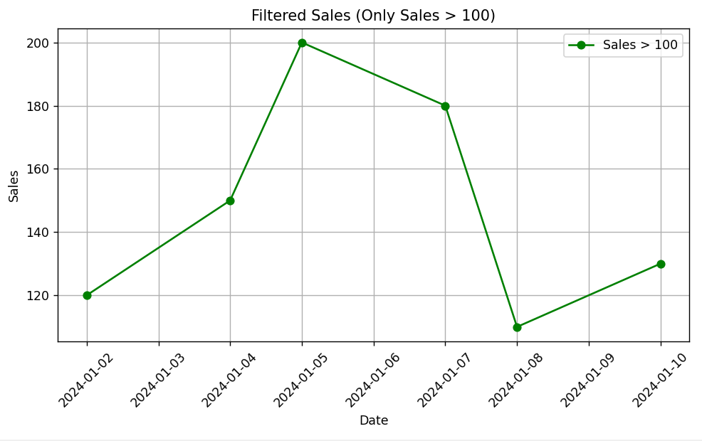
This code filters and plots the sales data, displaying only the days where sales are greater than 100. The filtered data is then visualized as a line chart.
Code Explanation:
🔹 Data Preparation:
-
A dictionary is created with
'Date'and'Sales'for 10 consecutive days. -
A
pandas.DataFrameis formed using this dictionary.
🔹 Data Filtering:
-
df['Sales'] > 100filters out rows where sales are 100 or less. -
Result is stored in
filtered_df.
🔹 Plotting:
-
Line plot is drawn using
filtered_df['Date']vsfiltered_df['Sales']. -
marker='o'adds dots on each data point. -
color='green'sets the line color. -
plt.xticks(rotation=45)improves x-label readability. -
Title, axis labels, grid, and legend are added for clarity.
🔹 Displaying the Plot:
-
plt.show()renders the chart.
Program:
import matplotlib.pyplot as plt
import pandas as pd

# Sample data
data = {
    'Date': pd.date_range(start='2024-01-01', periods=10, freq='D'),
    'Sales': [80, 120, 90, 150, 200, 60, 180, 110, 95, 130]
}
df = pd.DataFrame(data)

# Data Filtering: Keep only sales greater than 100
filtered_df = df[df['Sales'] > 100]

# Plotting the filtered data
plt.figure(figsize=(8, 5))
plt.plot(filtered_df['Date'], filtered_df['Sales'], marker='o', color='green', label='Sales > 100')

# Formatting
plt.title('Filtered Sales (Only Sales > 100)')
plt.xlabel('Date')
plt.ylabel('Sales')
plt.xticks(rotation=45)  # Rotate x-axis labels for readability
plt.grid(True)
plt.legend()
plt.tight_layout()

# Displaying the plot
plt.show()
Output: