Create a Histogram of Unit Prices
Description:
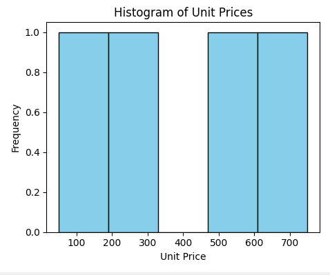
This program plots a histogram to display the distribution of unit prices across products using defined price intervals.
Code Explanation:
● Created a DataFrame using the original sales data.
● Selected the 'Price' column to represent unit prices of products.
● Used plt.hist() to create a histogram of the unit prices.
● Set bins=5 to divide the price range into 5 intervals.
● Added color and edge color for better visual appeal.
● Labeled axes and added title to describe the chart clearly.
● Used tight_layout() to neatly fit the plot elements.
Program:
import matplotlib.pyplot as plt
import pandas as pd

# Sample data
data = {
    'OrderID': [101, 102, 103, 104],
    'Product': ['Laptop', 'Tablet', 'Smartphone', 'Headphones'],
    'Quantity': [2, 5, 3, 10],
    'Price': [750, 300, 500, 50],
    'Date': ['2025-01-01', '2025-01-01', '2025-01-02', '2025-01-02']
}

# Create DataFrame
df = pd.DataFrame(data)

# Plotting the histogram
plt.figure(figsize=(8, 5))
plt.hist(df['Price'], bins=5, color='skyblue', edgecolor='black')
plt.title('Histogram of Unit Prices')
plt.xlabel('Unit Price')
plt.ylabel('Frequency')
plt.tight_layout()
plt.show()
Output: